LAURA KAY
I led the research, design, and development of a visual identity for Laura Kay Interiors — a studio dedicated to creating joyful, functional, and human-centred spaces. The result is a refined, flexible system that reflects the brand’s values and scales beautifully across digital and physical applications.

Research
Laura Kay specialises in crafting interior spaces that prioritise well-being, productivity, and alignment with brand identity. My task was to translate this ethos into a visual language that could express both the studio’s modern professionalism and its warm, human touch.
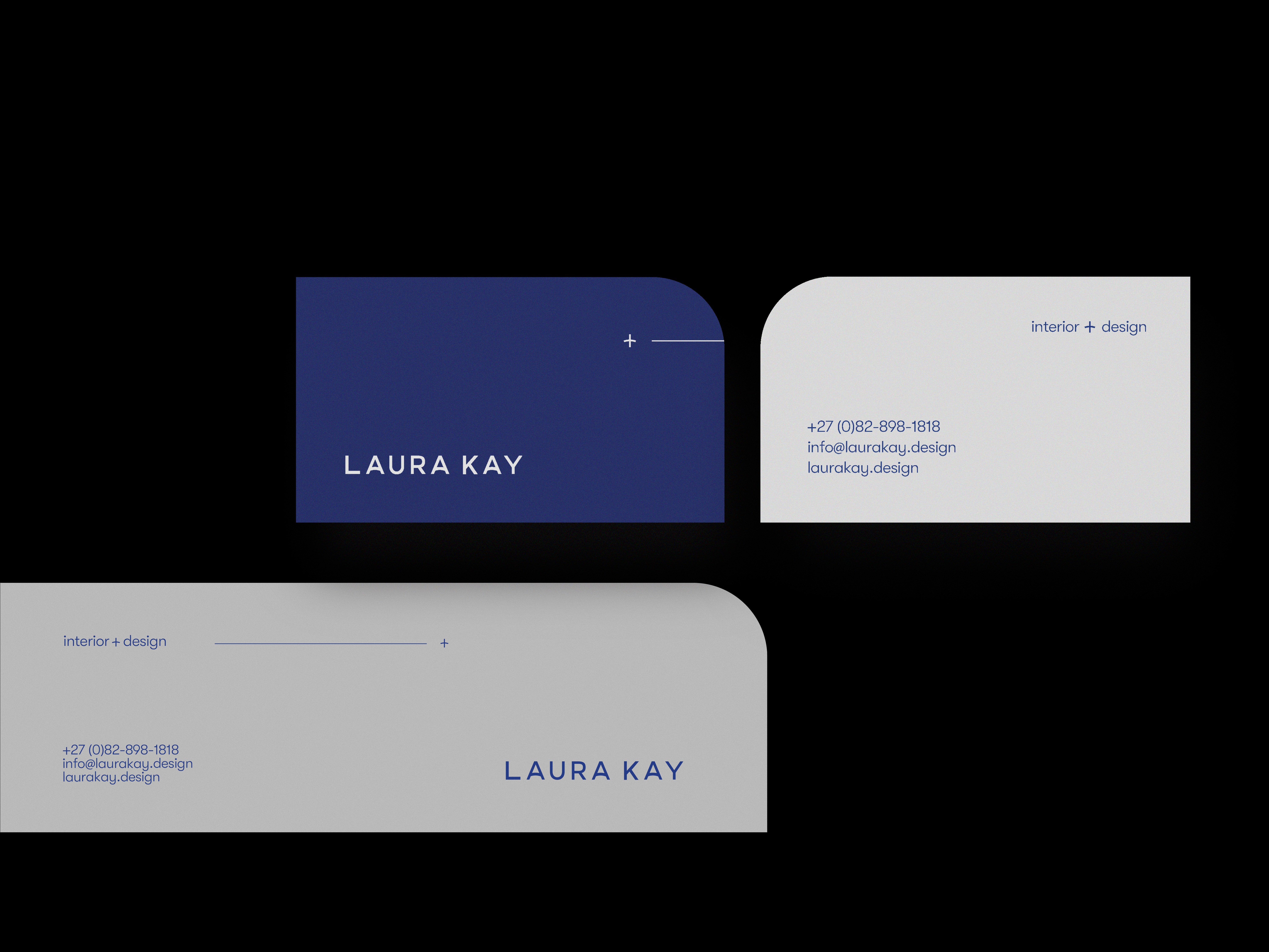
I began by uncovering the emotional and strategic foundations of the brand: joy, clarity, and thoughtful functionality. These became the anchors of a typographic-led identity system that plays with structure and contrast — using a modular grid, warm modernist fonts, and a palette of neutrals with bright accents. The logo itself integrates into the grid, allowing layouts to remain dynamic yet cohesive.
To support Laura Kay’s growth, I developed a flexible design system with scalable components and layout rules. This allows the brand to stay visually consistent across print, digital, and spatial formats, while still feeling alive, layered, and personal.
Design
Through interviews, brand workshops, and competitor analysis, I helped uncover the emotional and strategic positioning of the brand: a studio that blends clarity with creativity, structure with play. These insights grounded the direction of the identity system and ensured the work would reflect the values at the heart of the business.
I designed a modular typographic system that acts as both structure and signature. The logotype was custom set to integrate into the grid creating playful yet precise moments across collateral. Font choices balance professionalism with warmth, while the colour palette adds brightness and contrast without losing coherence. The system was designed to allow for clever, layered layout work that supports storytelling across media.