YOCO
EVENT BRANDING AND DESIGN
WHAT'S NEXT?

Concept
The central idea was rooted in transformation. Next isn't just a name it's a declaration. We positioned the event around the idea that the future is written today, and this moment was Yoco's inflection point: a new era of hardware, software, and ambition.
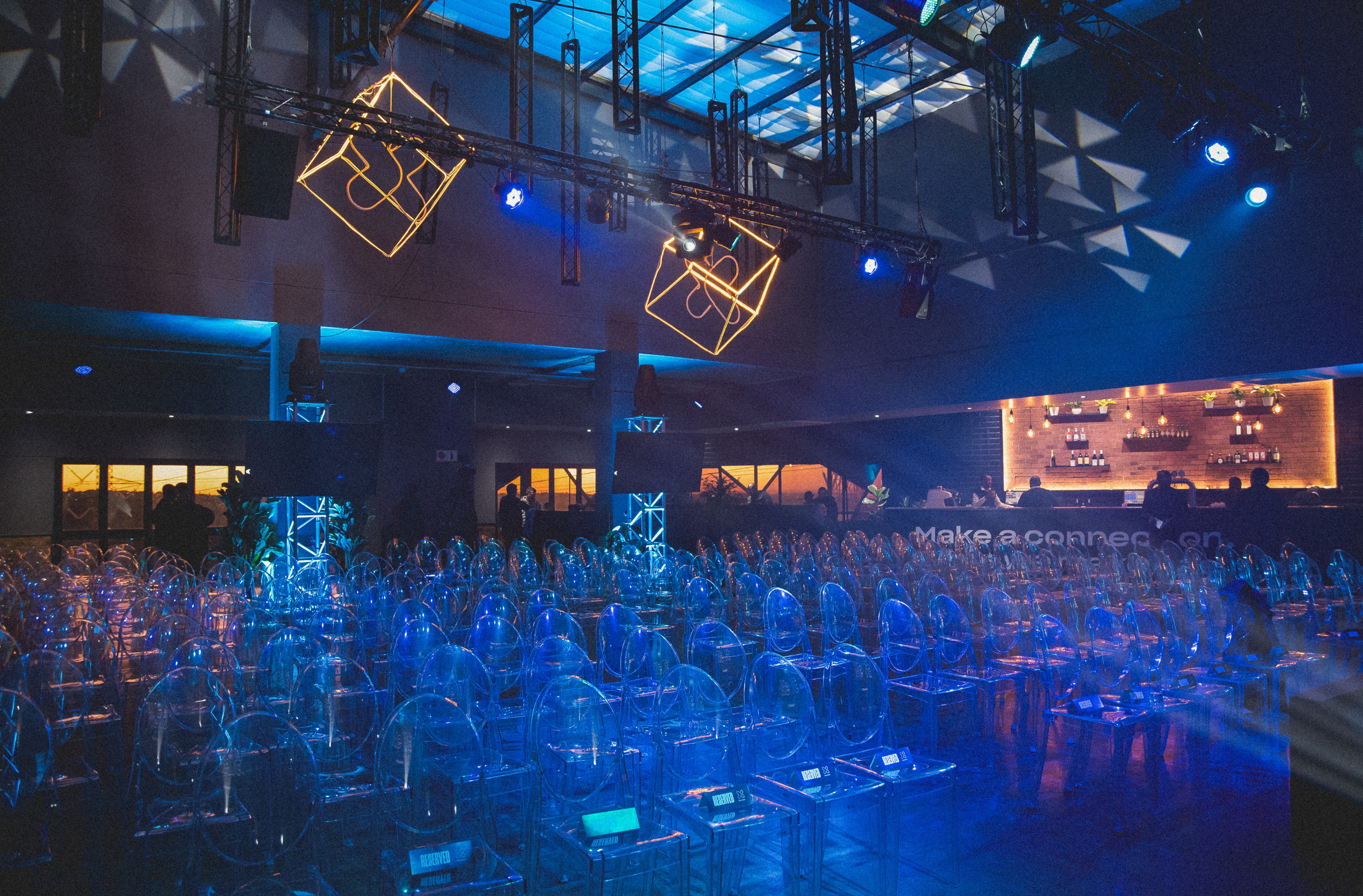
The creative concept drew on the energy of a spark, that precise moment of ignition between where a business has been and where it's going. Visually, this translated into a bold, forward-leaning identity that blended enterprise-grade confidence with the raw creativity of South African entrepreneurship. Every touchpoint stage design, motion graphics, collateral, and digital assets was designed to feel like a reveal.
Working alongside designer Kelsy Arden, the collaboration was built on a clear division of creative ownership while staying tightly aligned on the visual language. My role as Creative Director meant setting the conceptual framework and ensuring coherence across every channel, while empowering the team to execute with autonomy and precision. The result was a cohesive system that felt intentional at every scale from a screen graphic to a full stage backdrop.
Design
The design strategy centred on momentum, evolution, and clarity:
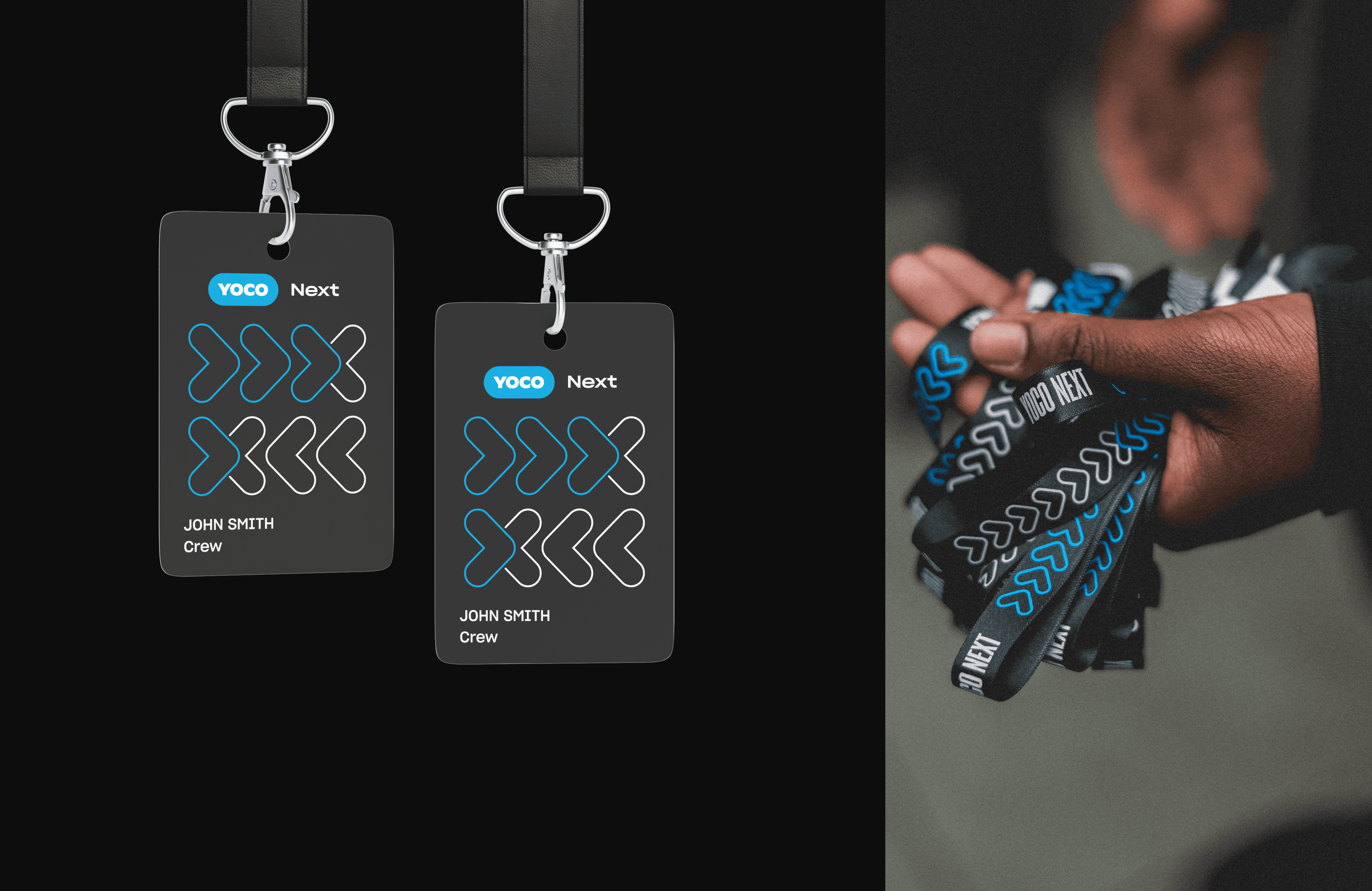
Visual Identity: A bold typographic system and high-contrast palette created a sense of ceremony around the product reveal,this wasn't just an update, it was a milestone.
Stage & Environment: The spatial design extended the brand language into three dimensions, reinforcing the sense of stepping into something new.
Motion & Digital: Animated assets and digital collateral carried the spark metaphor through to screens and social, maintaining energy before, during, and after the event.
Team Direction: Clear creative briefs and a structured feedback loop kept the team moving efficiently under event timelines without sacrificing craft.
Every design decision served the central narrative: Yoco isn't catching up, it's leading.