FYN
RESTAURANT BRANDING
HUNT. GATHER. SEEK
Restaurant branding for FYN, a fine dining restaurant. We built the identity on Hunt, Gather, Seek: refined but raw, minimalist but emotional, made to evolve.
Client
FYN
Services
Brand identity · Creative direction · Iconography · Menu & collateral design
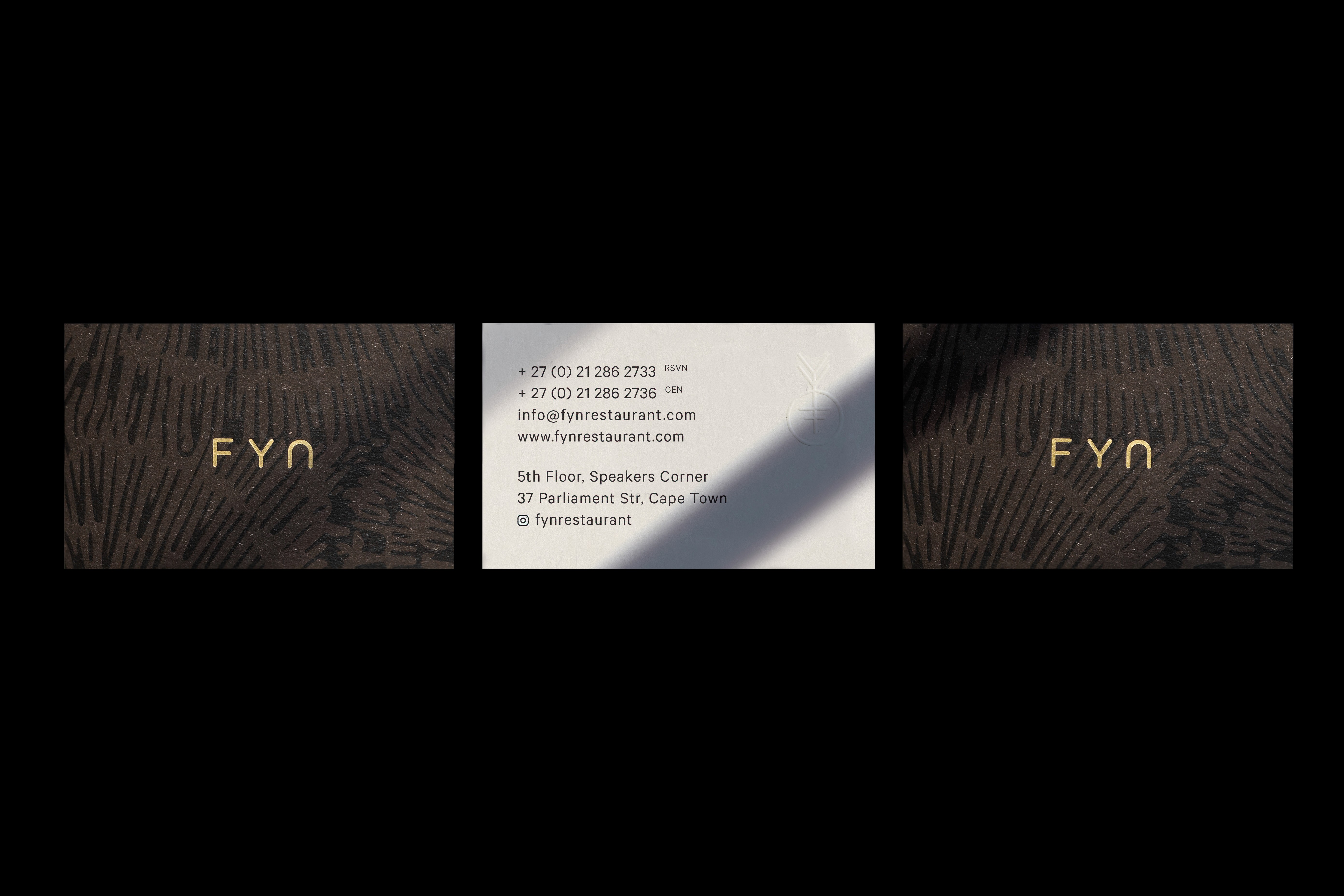
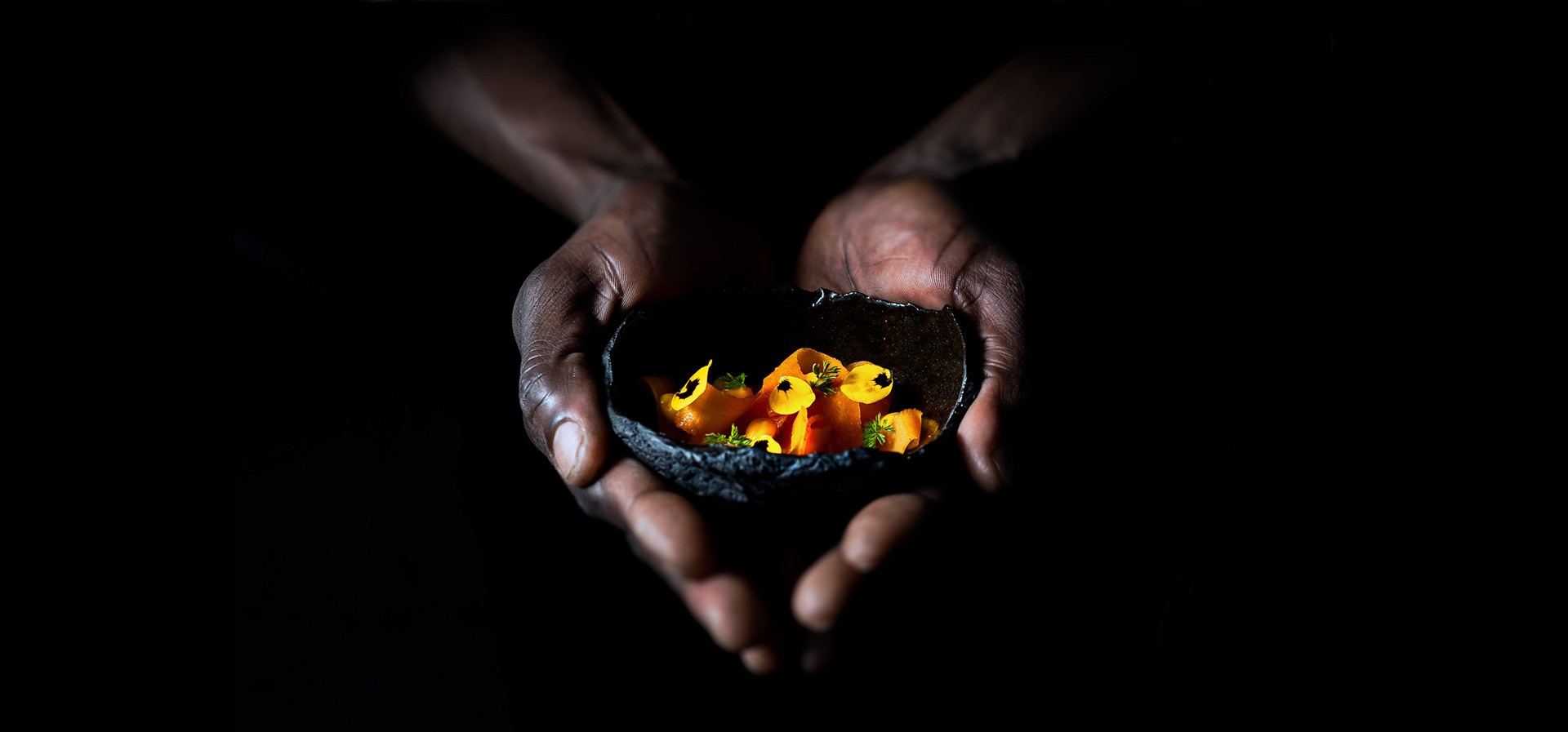
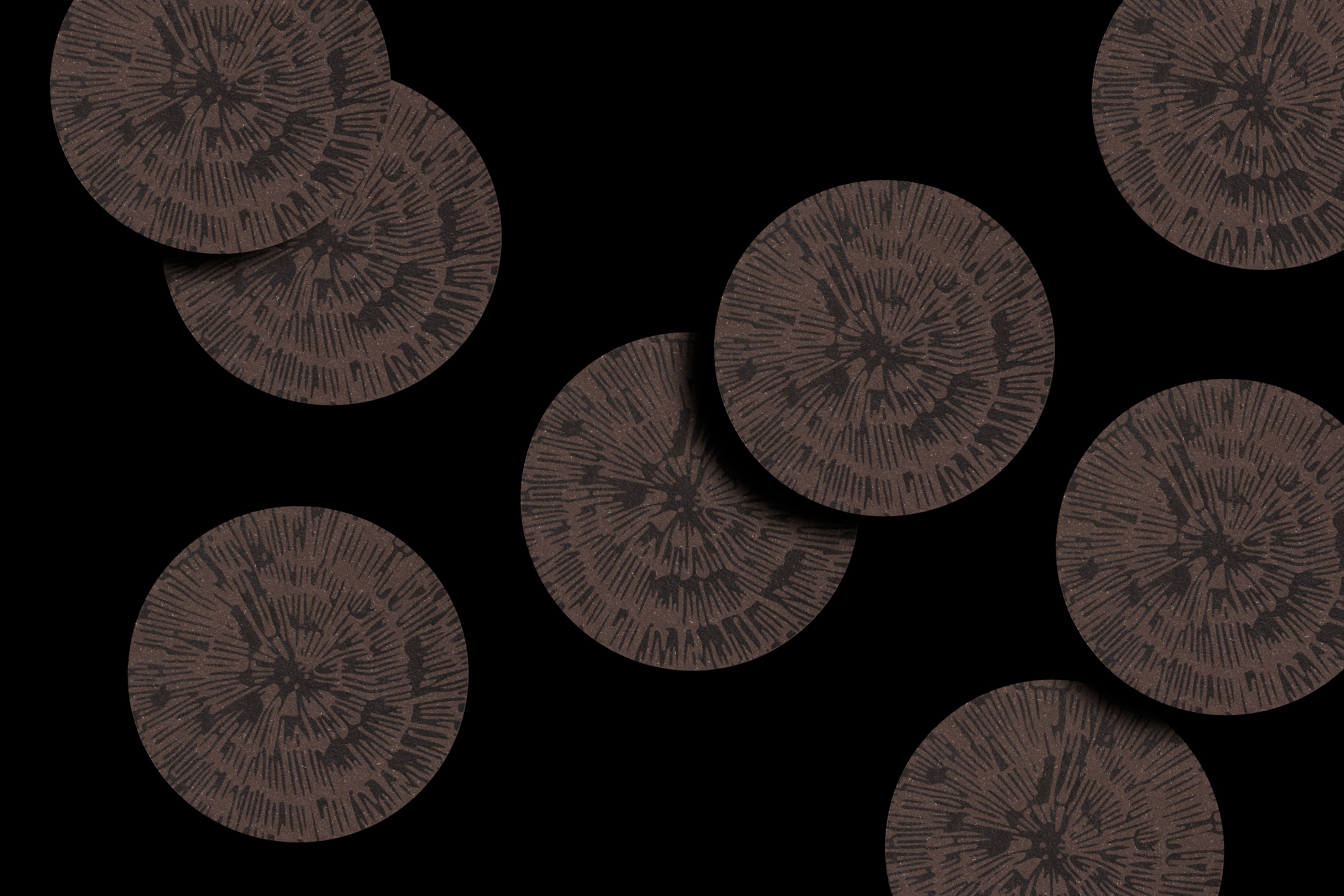
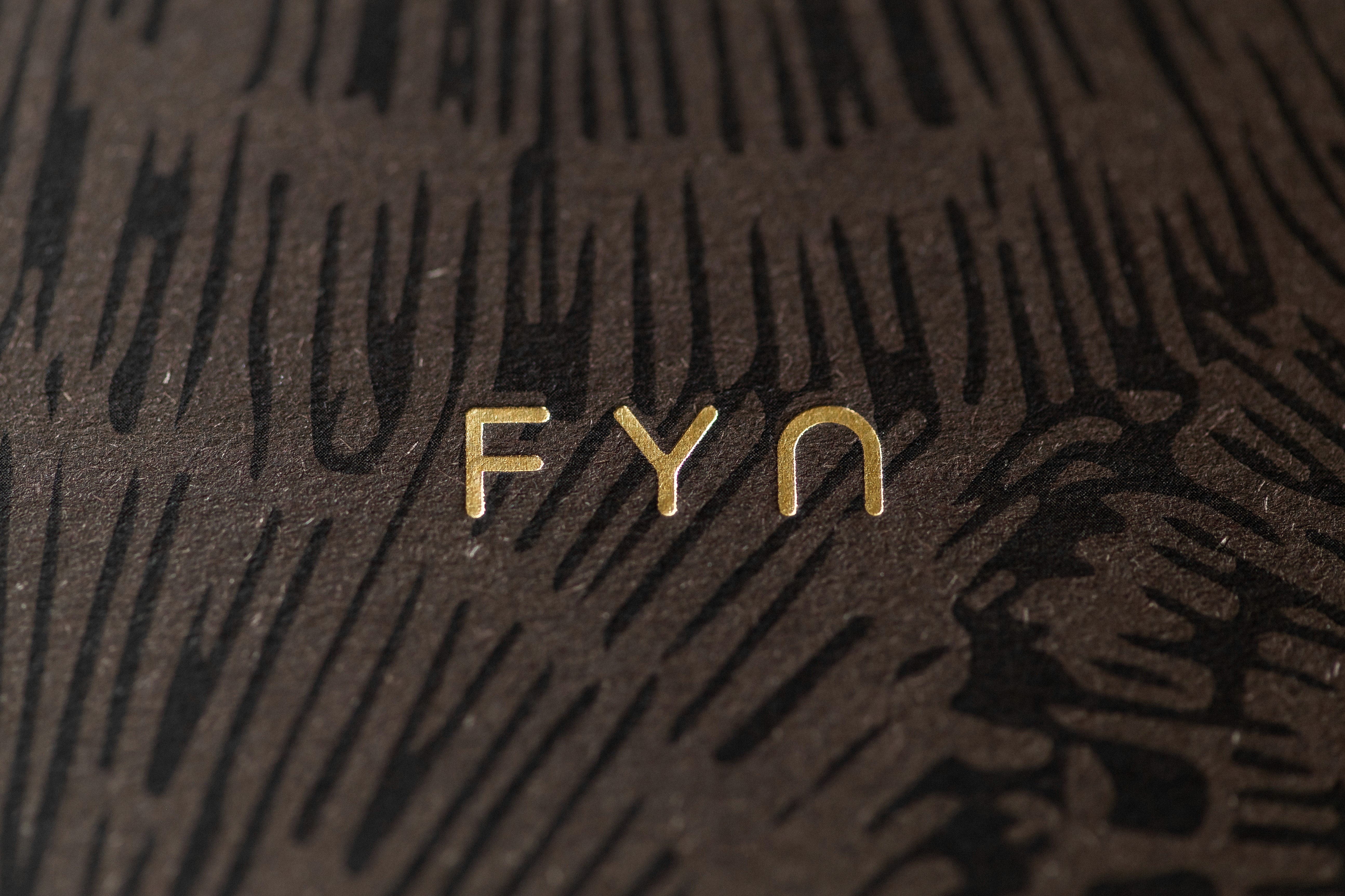
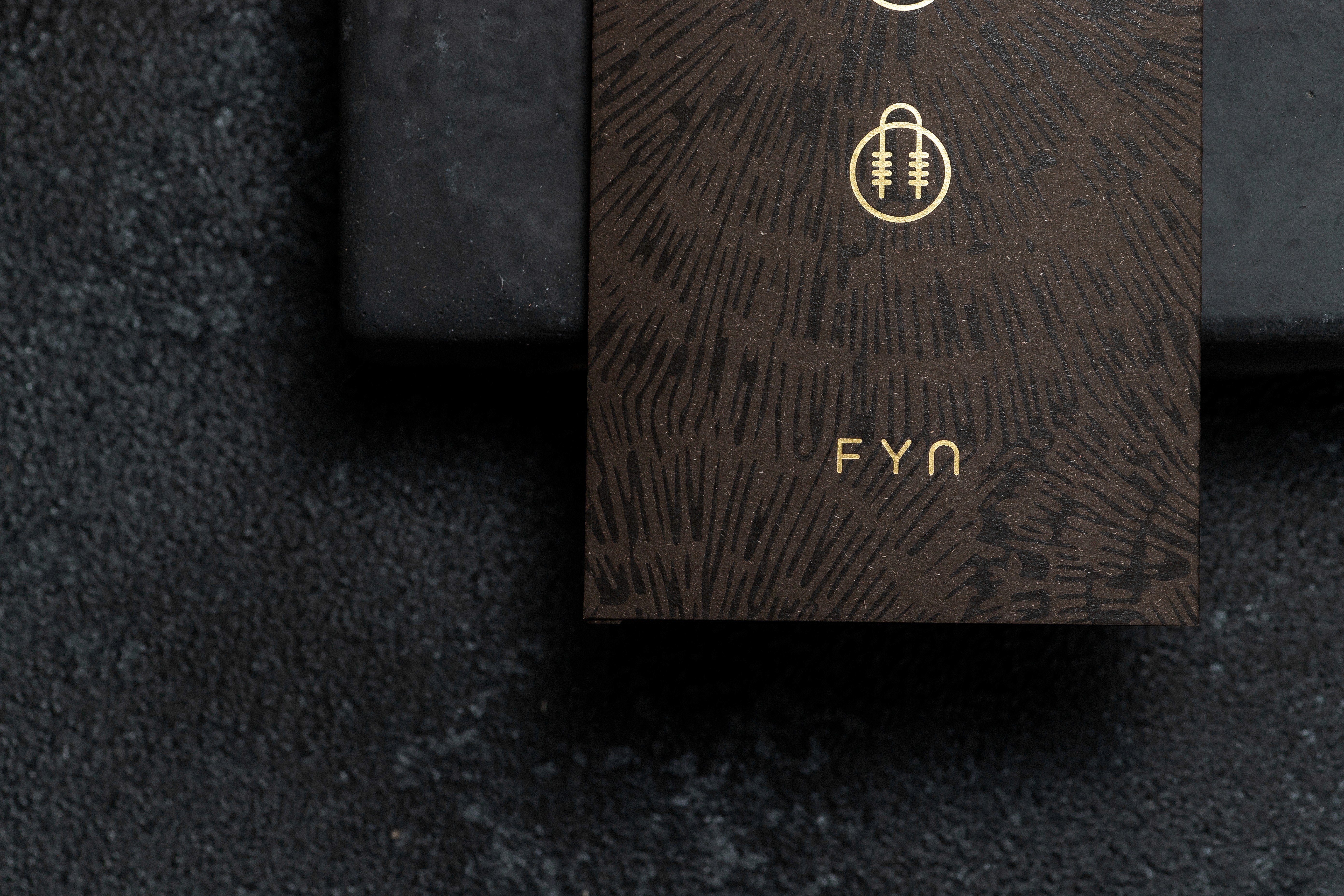
Restaurant branding for FYN: creative direction and identity design for fine dining
FYN is a fine dining restaurant built on tension: wild South African ingredients set against the precision of contemporary cuisine. We were commissioned to create a visual identity that could hold that tension. It had to be refined but raw, minimalist but emotional, traditional but boundary-pushing. A logo was only the start. The aim was to express the soul of the space and the food, and to build a living system that evolves with the restaurant.
The concept: Hunt, Gather, Seek
We started with the philosophy behind FYN’s food, a fusion of South African storytelling and the structure of a Japanese Kaiseki meal. That led to the core concept: Hunt, Gather, Seek. It is a lens that reframes fine dining as a journey of discovery, for the chef and the guest alike.
We studied traditional Japanese Hanko seal stamps for their symbolism and restraint, and explored how nature, texture and ritual could shape the visual language without becoming ornamental or clichéd.
Logo and icon design inspired by Hanko seals
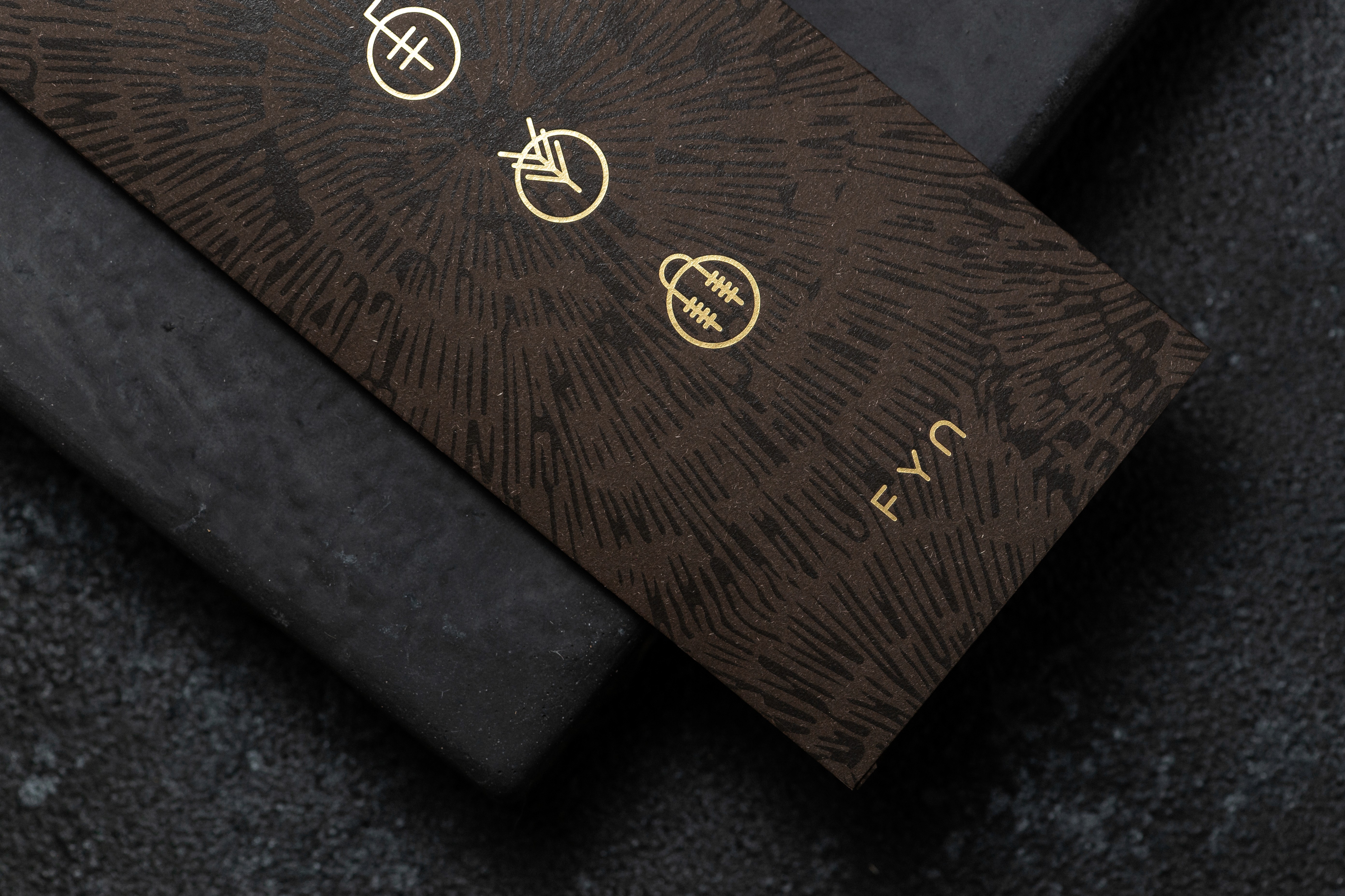
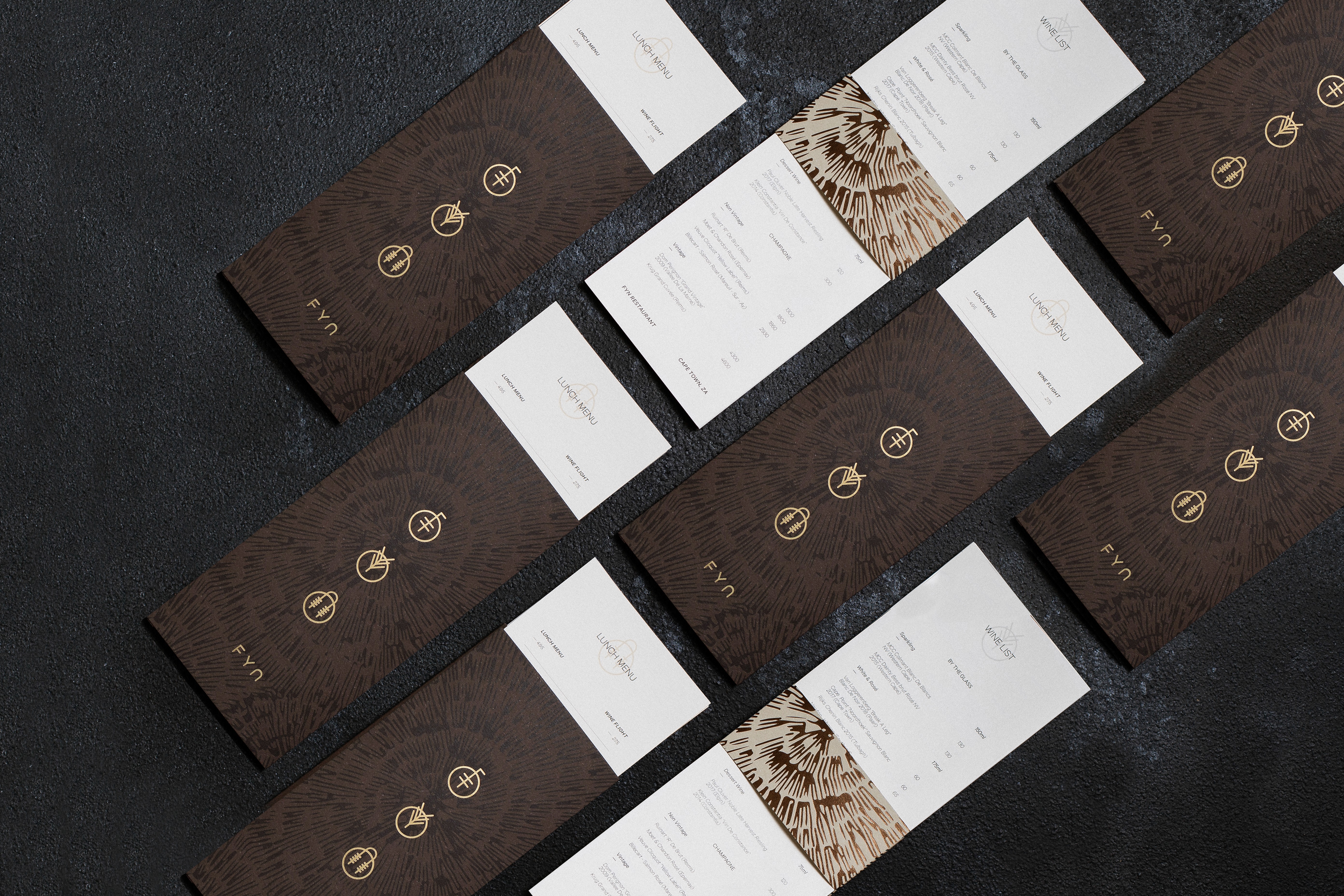
The identity system is built around three custom icons, one each for hunt, gather and seek, all influenced by Hanko mark-making. Each mark deliberately breaks out of its circular frame, a metaphor for the way FYN keeps pushing past the boundaries of traditional fine dining.
Colour, type and texture drawn from the space
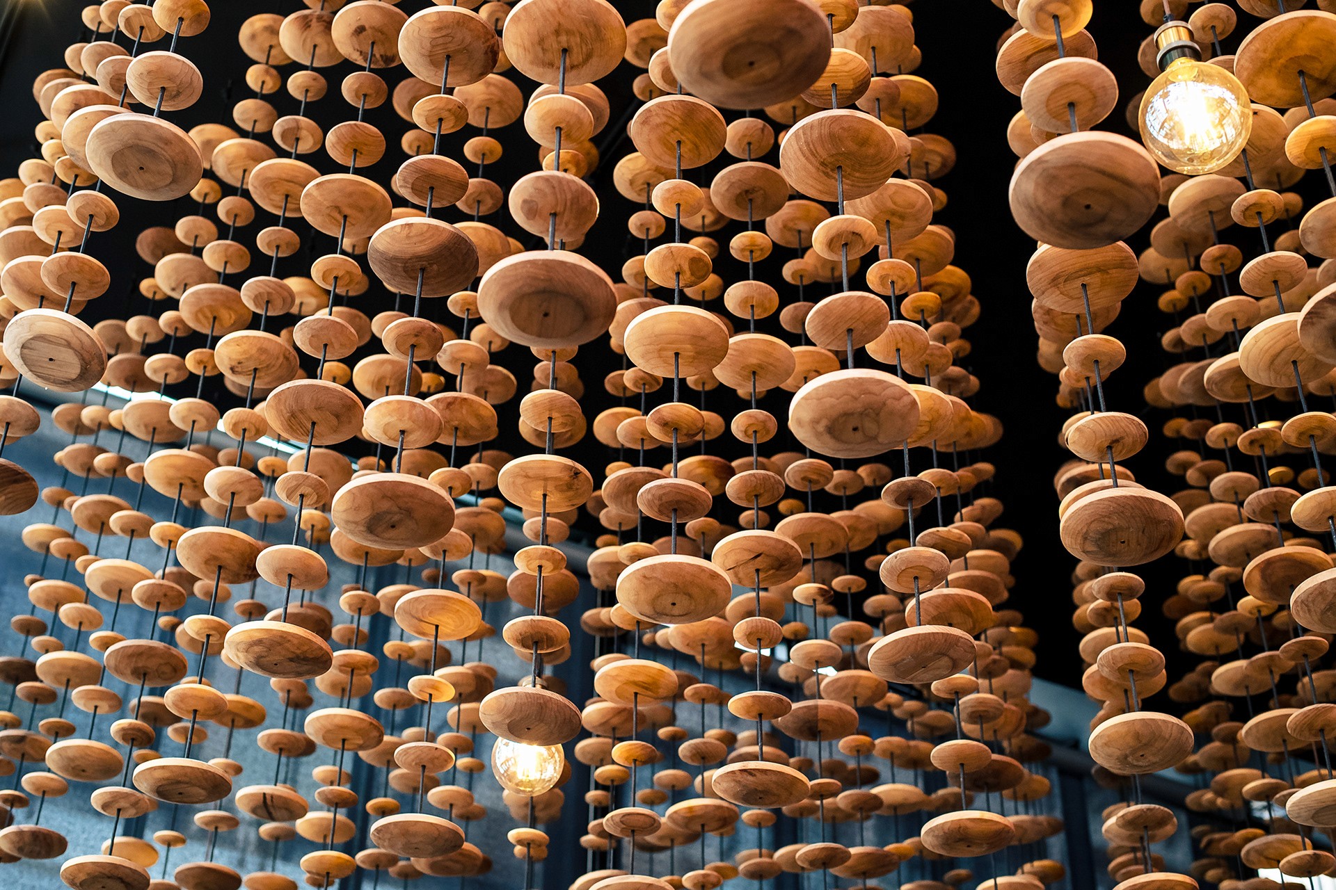
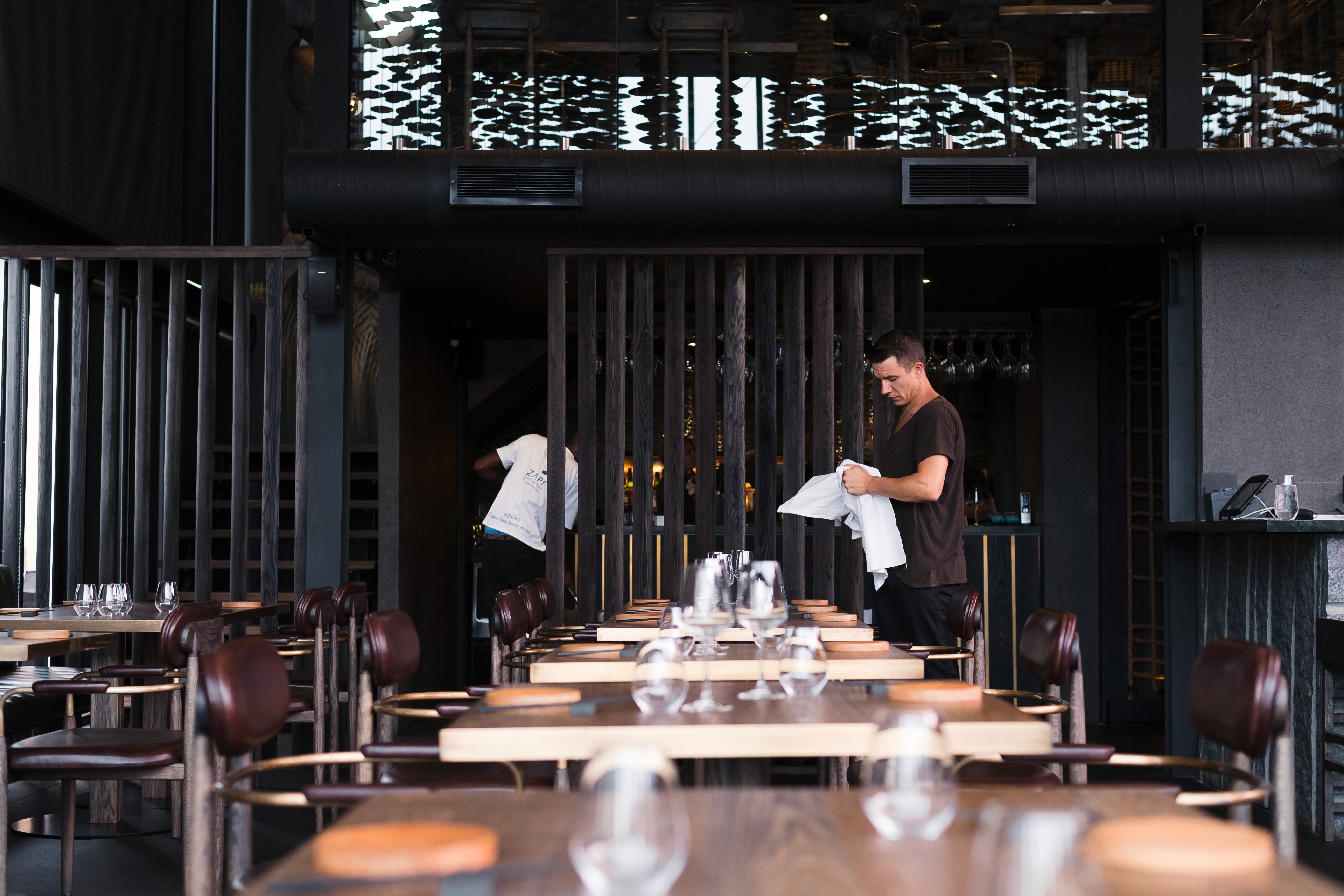
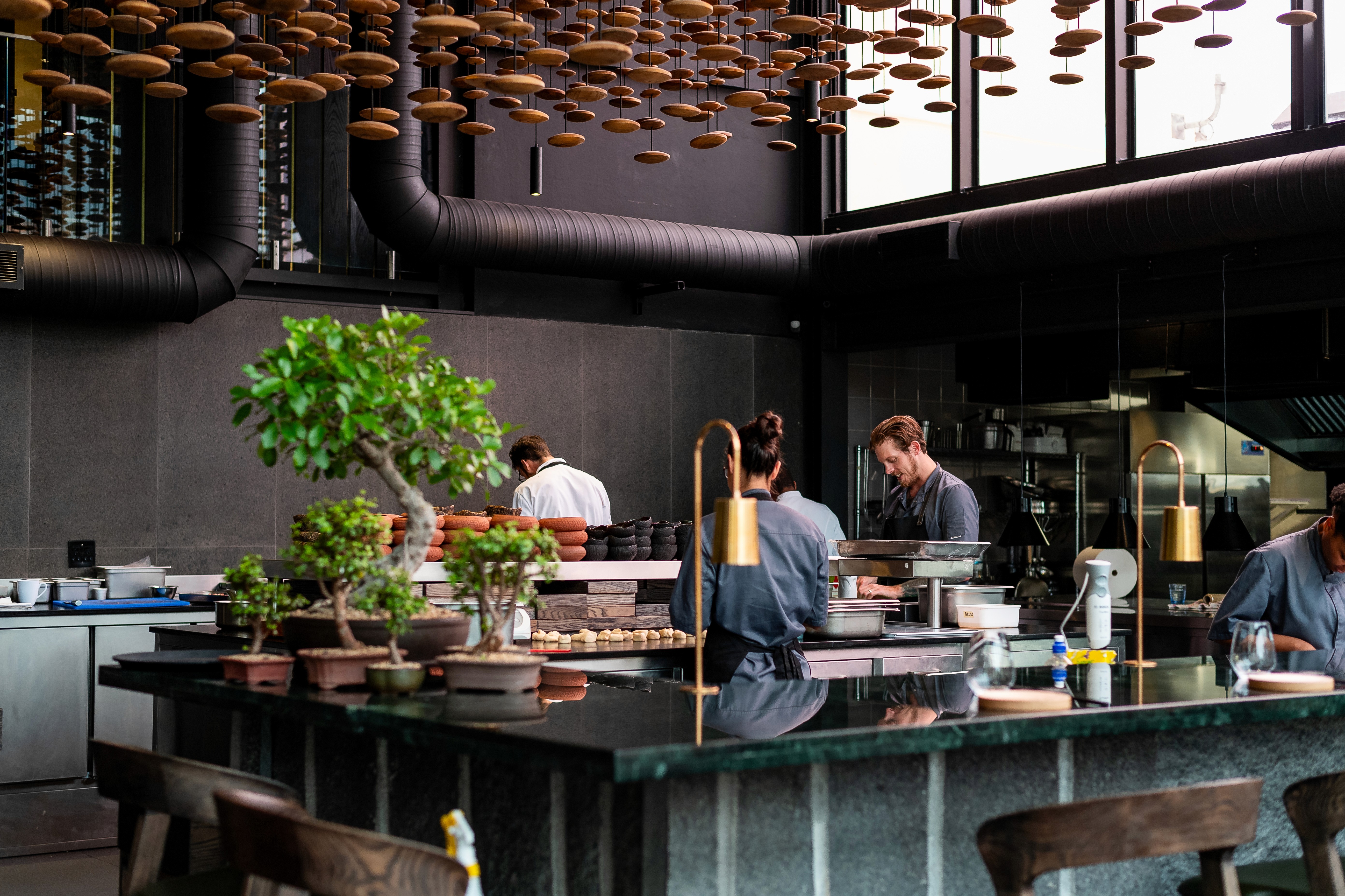
We paired the icons with a dark, earthy colour palette that mirrors the interior: blackened wood, aged brass and deep chocolate tones. The typography is sharp and restrained, so the icons and materials carry the emotional weight.
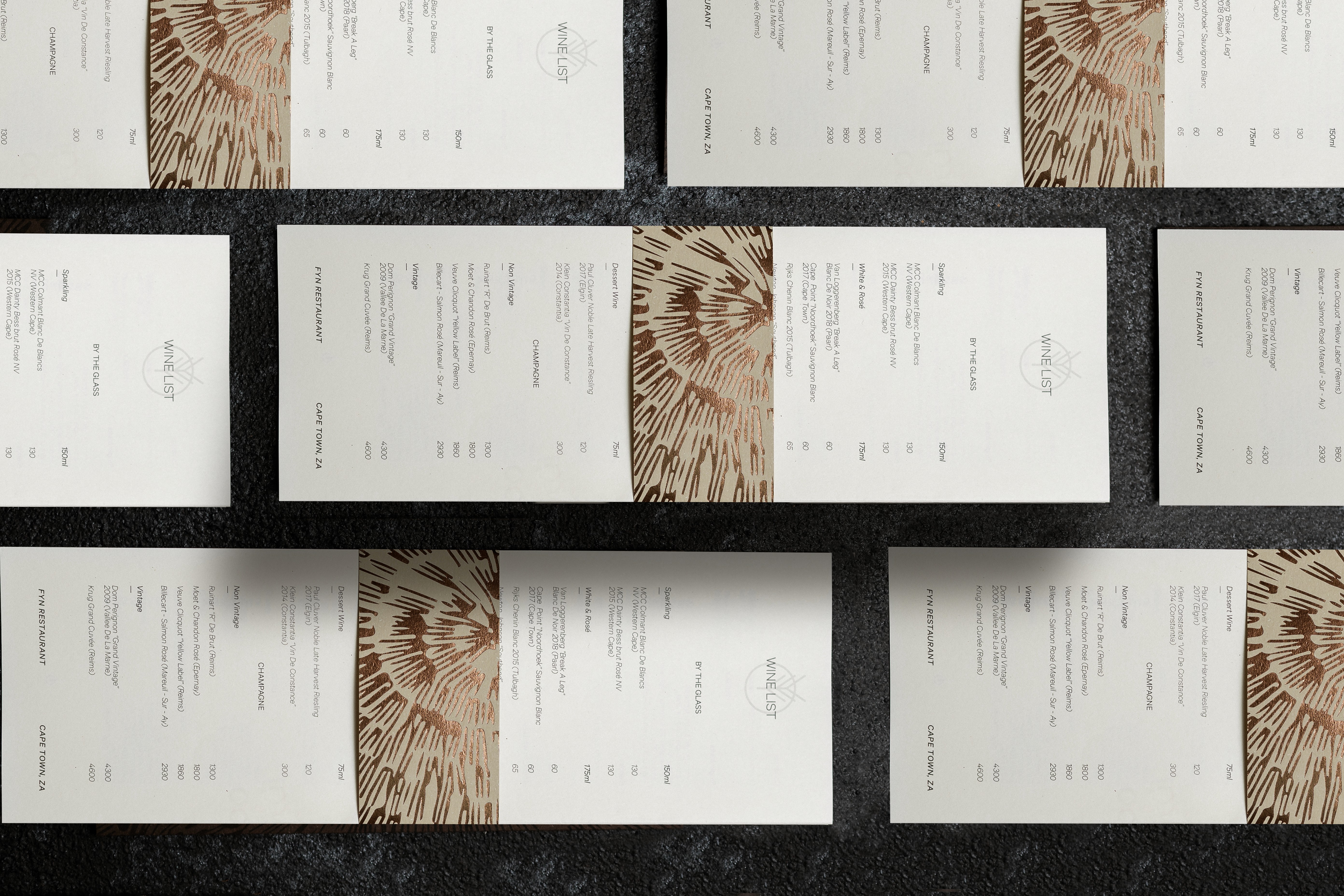
Textures drawn from nature and raw materials run across the menus and collateral, echoing the atmosphere of the restaurant. They are never there for decoration. Each one is a physical expression of the ingredients and the space.
Menu design and a flexible production system
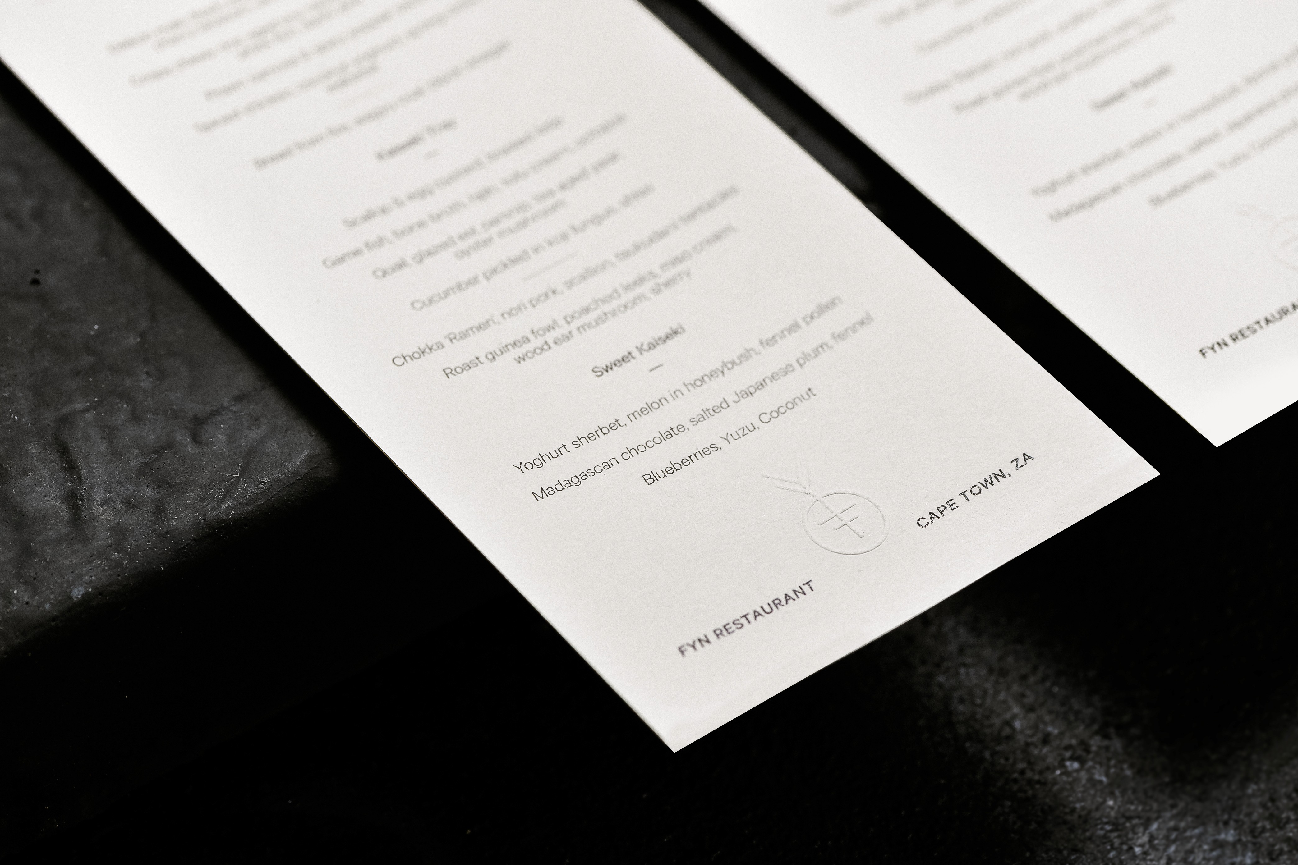
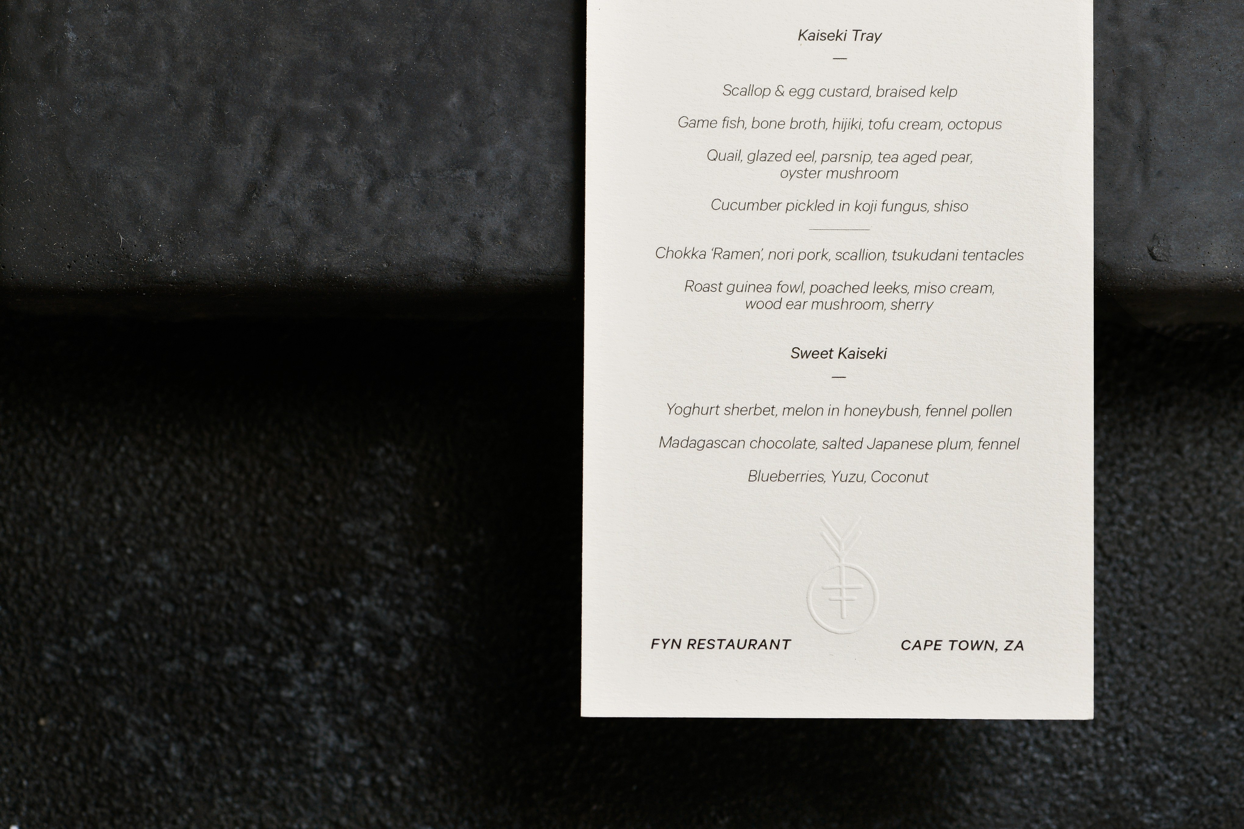
FYN changes its menus with the seasons, sometimes weekly, so we designed a flexible production system that lets the in-house team update them quickly without losing visual consistency. Templates, type scales and texture systems give the team what it needs to produce new printed menus and materials on the fly.
The result is an identity that feels lived-in and dynamic: a design system that evolves as the restaurant does. For another identity project, see the Rooftop on Bree brand identity and website design.