YOCO
LAUNCH EVENT BRANDING
WHAT'S NEXT?
Product launch event branding for Yoco Next. As Creative Director, I led the creative vision, from concept to execution, around the spark of a new era.
Client
YOCO
Services
Creative direction · Event identity · Stage & motion design


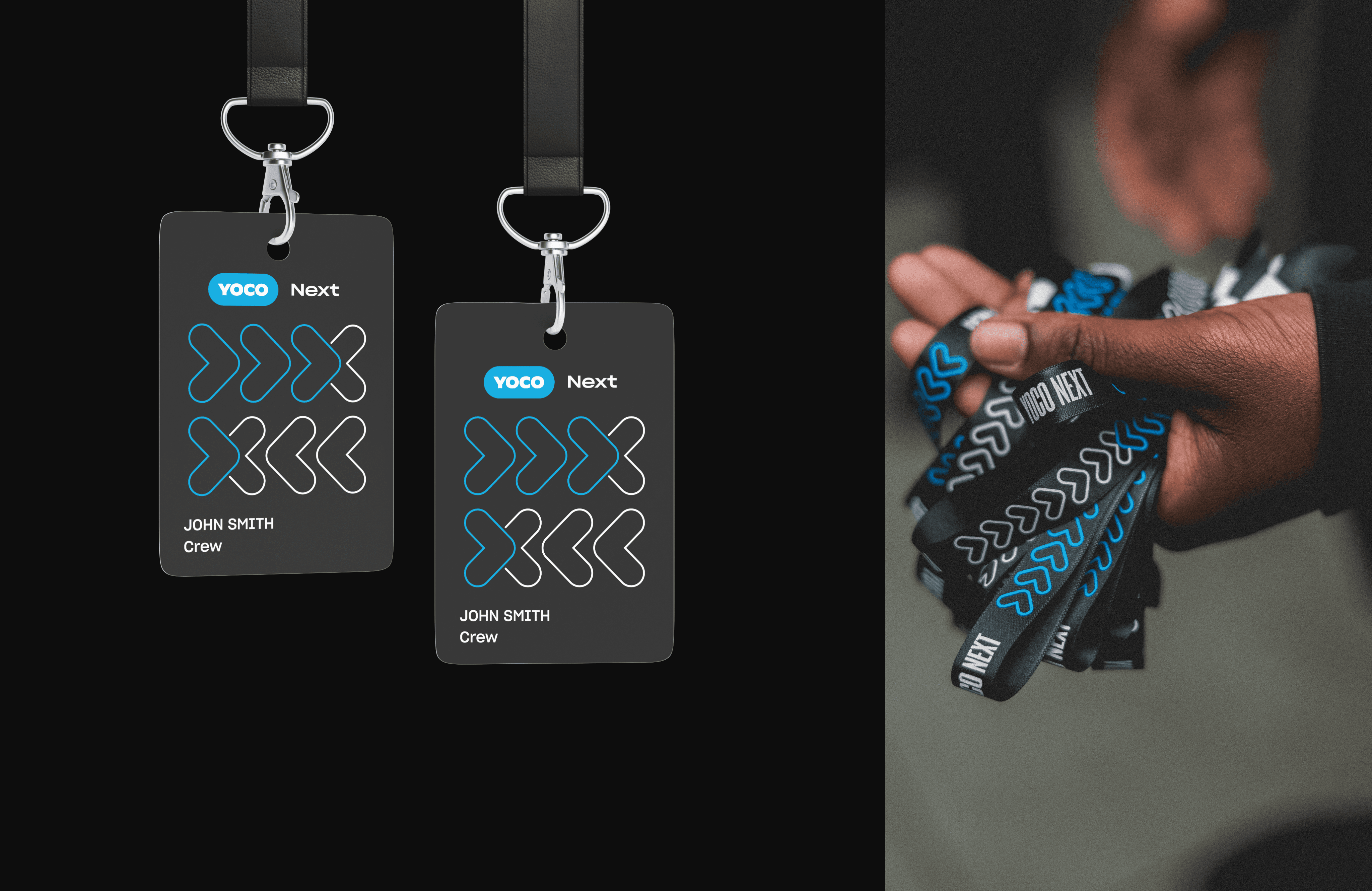

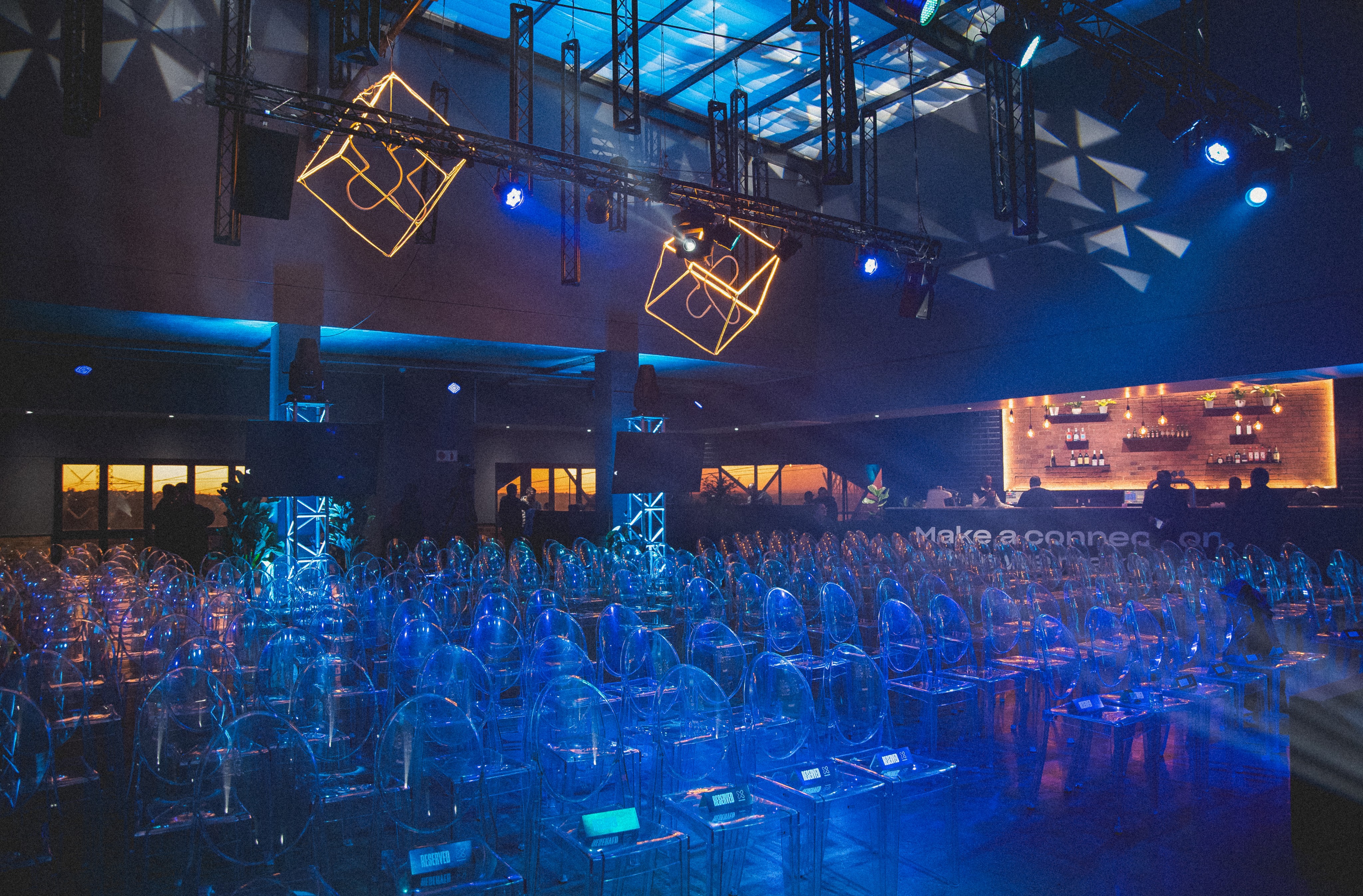


Yoco Next: product launch event branding for a South African payments platform
Yoco Next was a landmark product launch event marking the evolution of Yoco’s card machine and online product ecosystem. As Creative Director, I led the end-to-end creative vision, from concept development to event execution. My job was to shape a visual identity that captured entrepreneurial momentum and what it means to step boldly into what comes next.
The idea: the future is written today
The central idea was transformation, and we treated the name Next as a declaration. We positioned the event around the idea that the future is written today, and that this moment was Yoco’s inflection point: a new era of hardware, software and ambition.
The creative concept: the spark of what comes next
The concept drew on the energy of a spark: the precise moment of ignition between where a business has been and where it’s going. Visually, that became a bold, forward-leaning identity that pairs enterprise-grade confidence with the raw creativity of South African entrepreneurship.
Event identity across stage, motion, collateral and digital
Every touchpoint was designed to feel like a reveal: the stage design, the motion graphics, the collateral and the digital assets. The result was one cohesive system that felt intentional at every scale, from a single screen graphic to a full stage backdrop.
Creative direction with designer Kelsy Arden
I worked alongside designer Kelsy Arden. We split creative ownership clearly and stayed tightly aligned on the visual language. My role was to set the conceptual framework and keep every channel coherent, while giving the team room to execute with autonomy and precision.
For more of my work with Yoco, see the Yoco website design and direction case study.