CLAYLAT
CERAMICS BRAND IDENTITY
THE OLDEST TRADITION
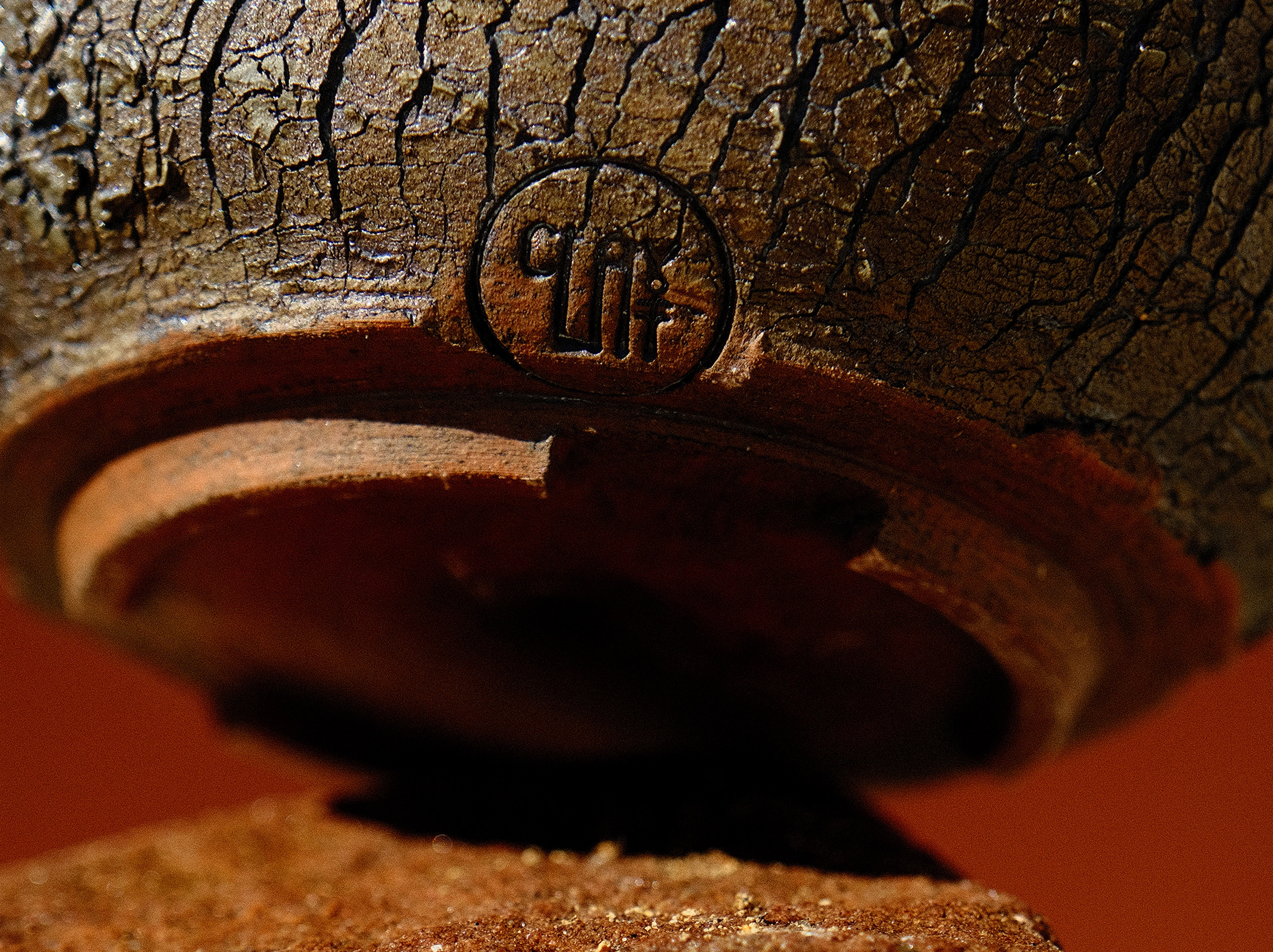
Ceramics brand identity for Claylat, whose dinnerware, planters and sculptural pieces draw on the Cape landscape, with marks inspired by ancient cave symbols.
Client
CLAYLAT
Services
Brand identity · Logo design · Illustration · Art direction

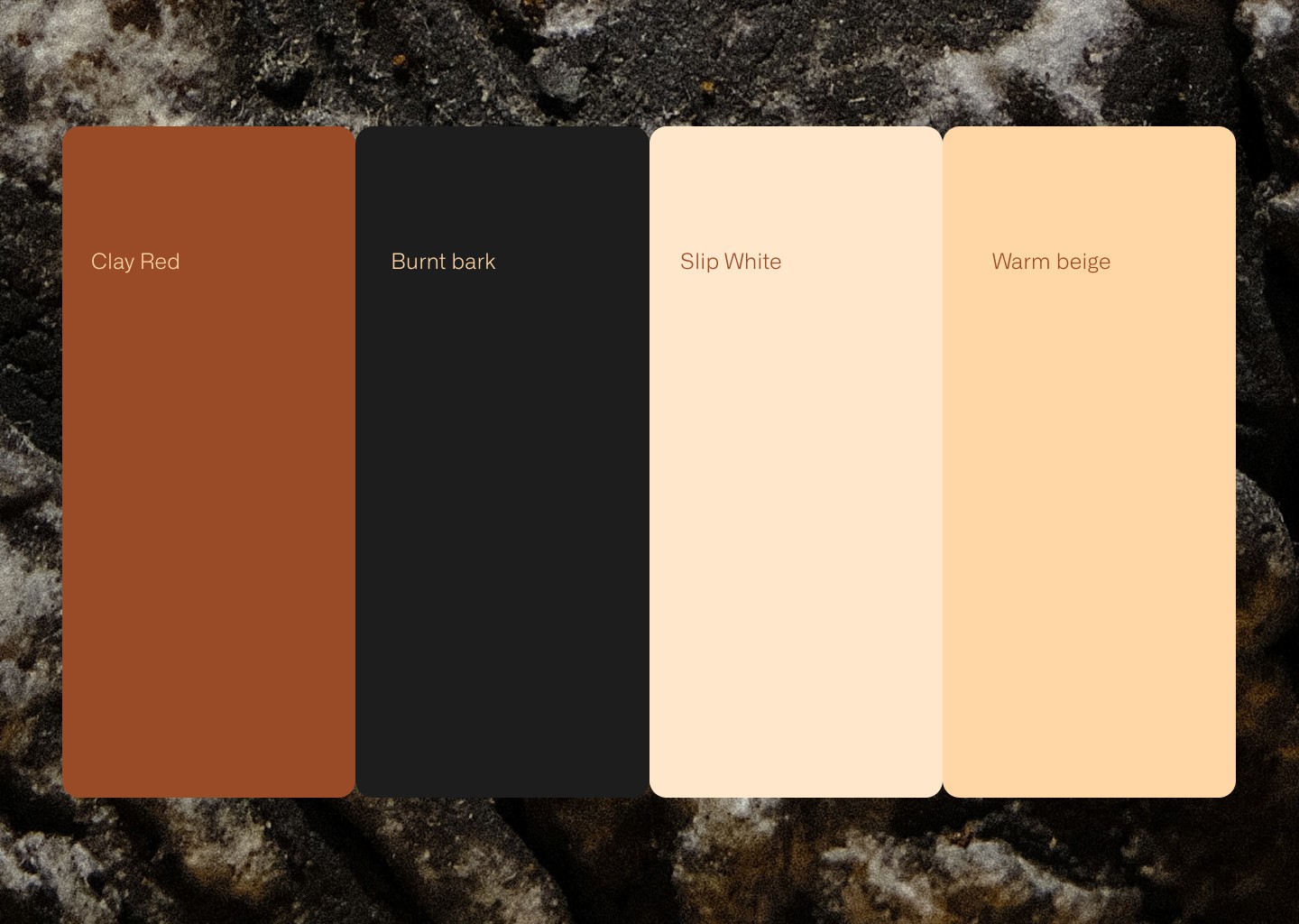
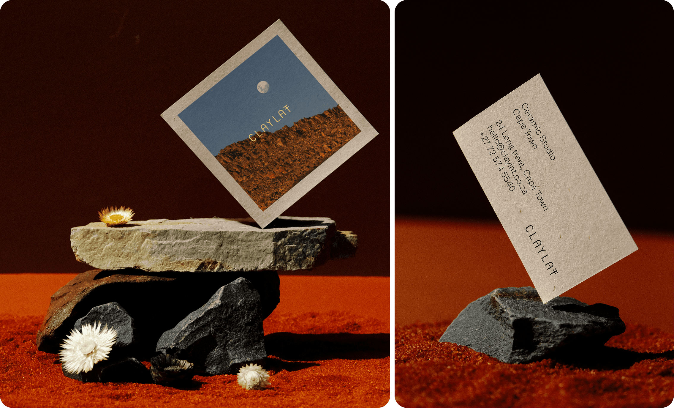

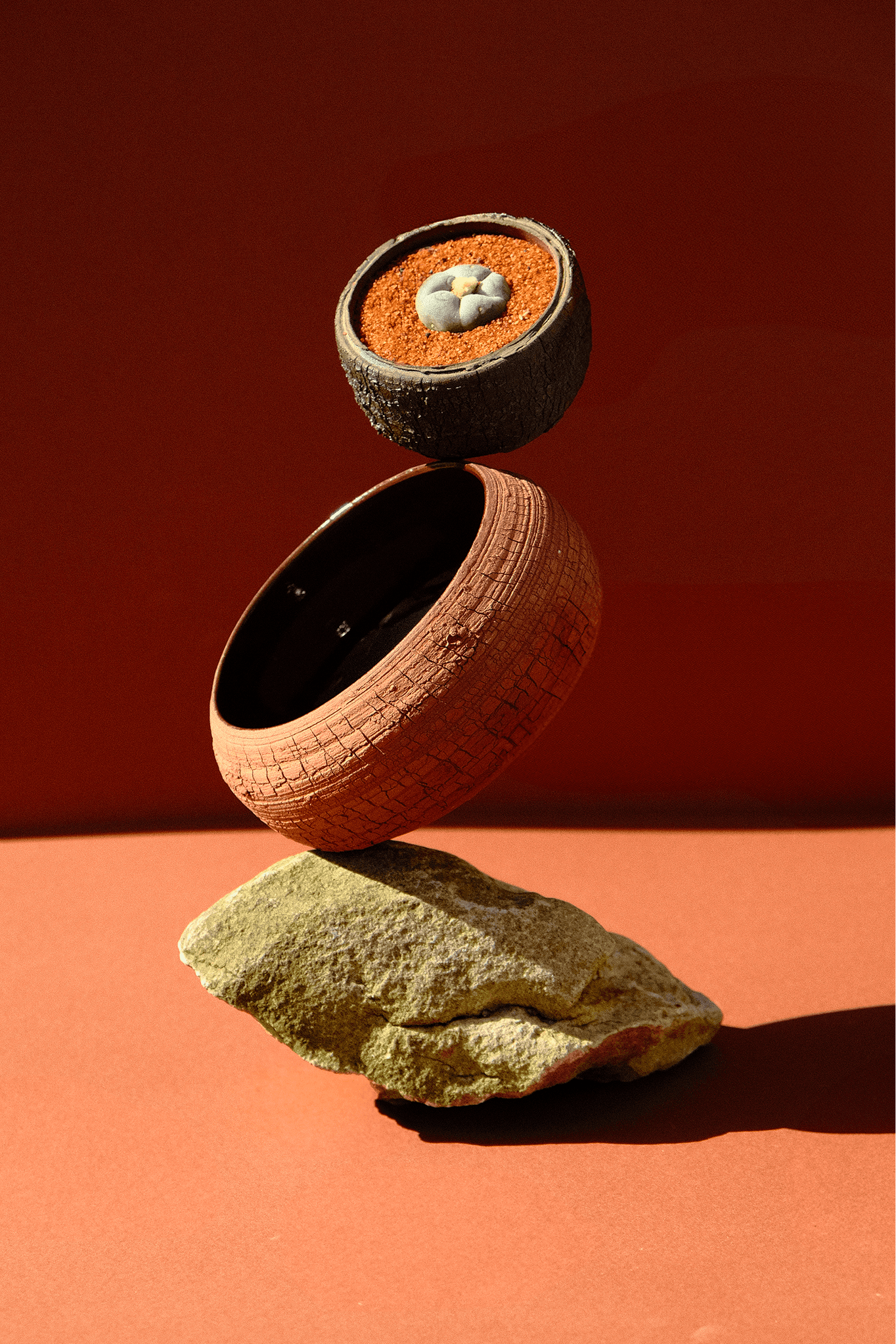
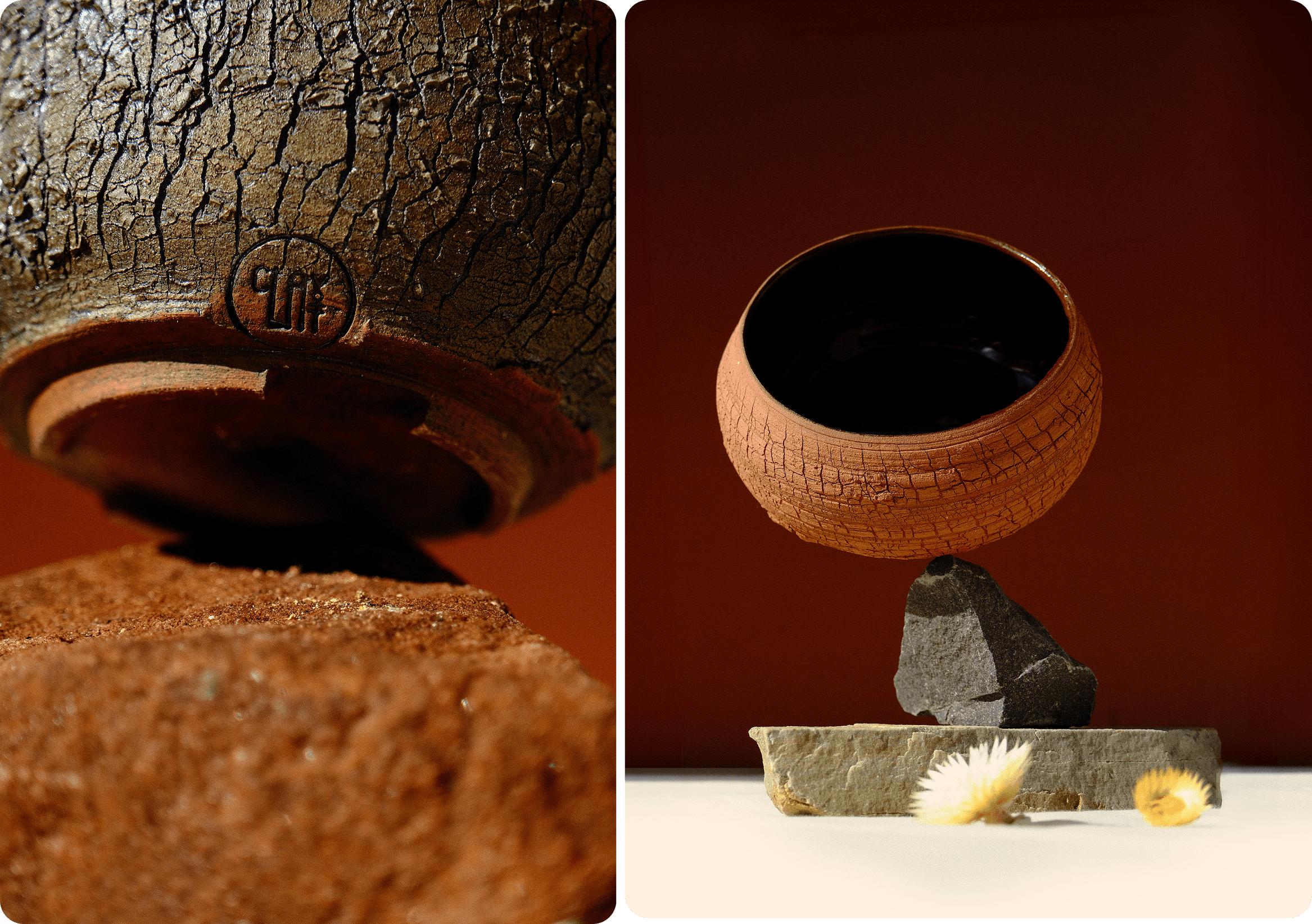



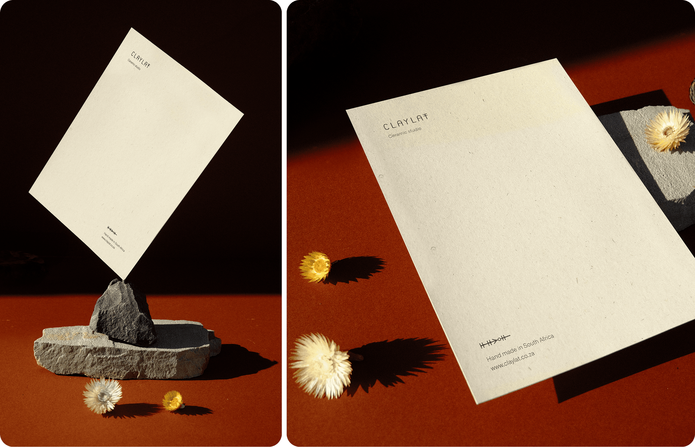
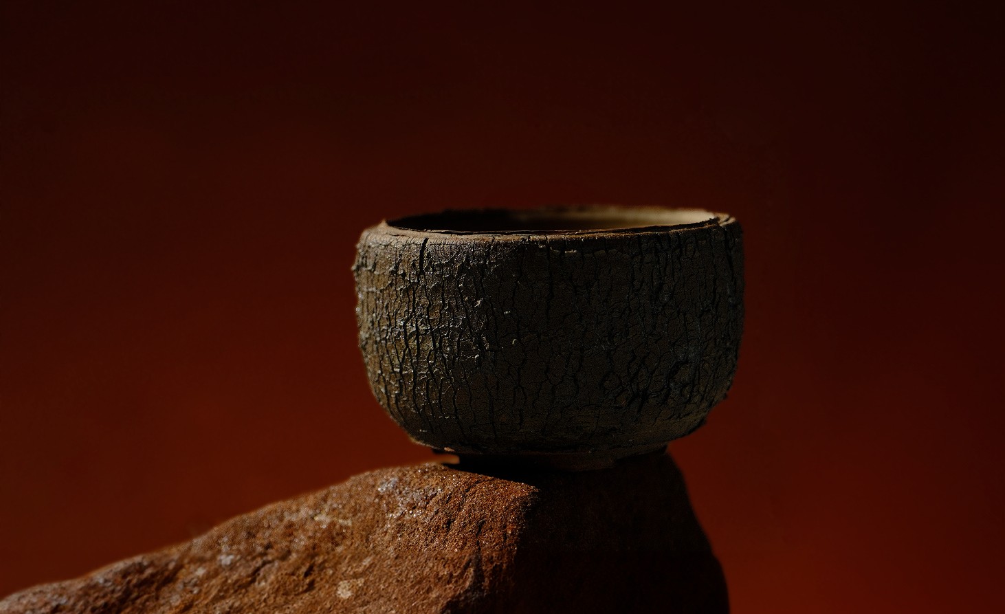
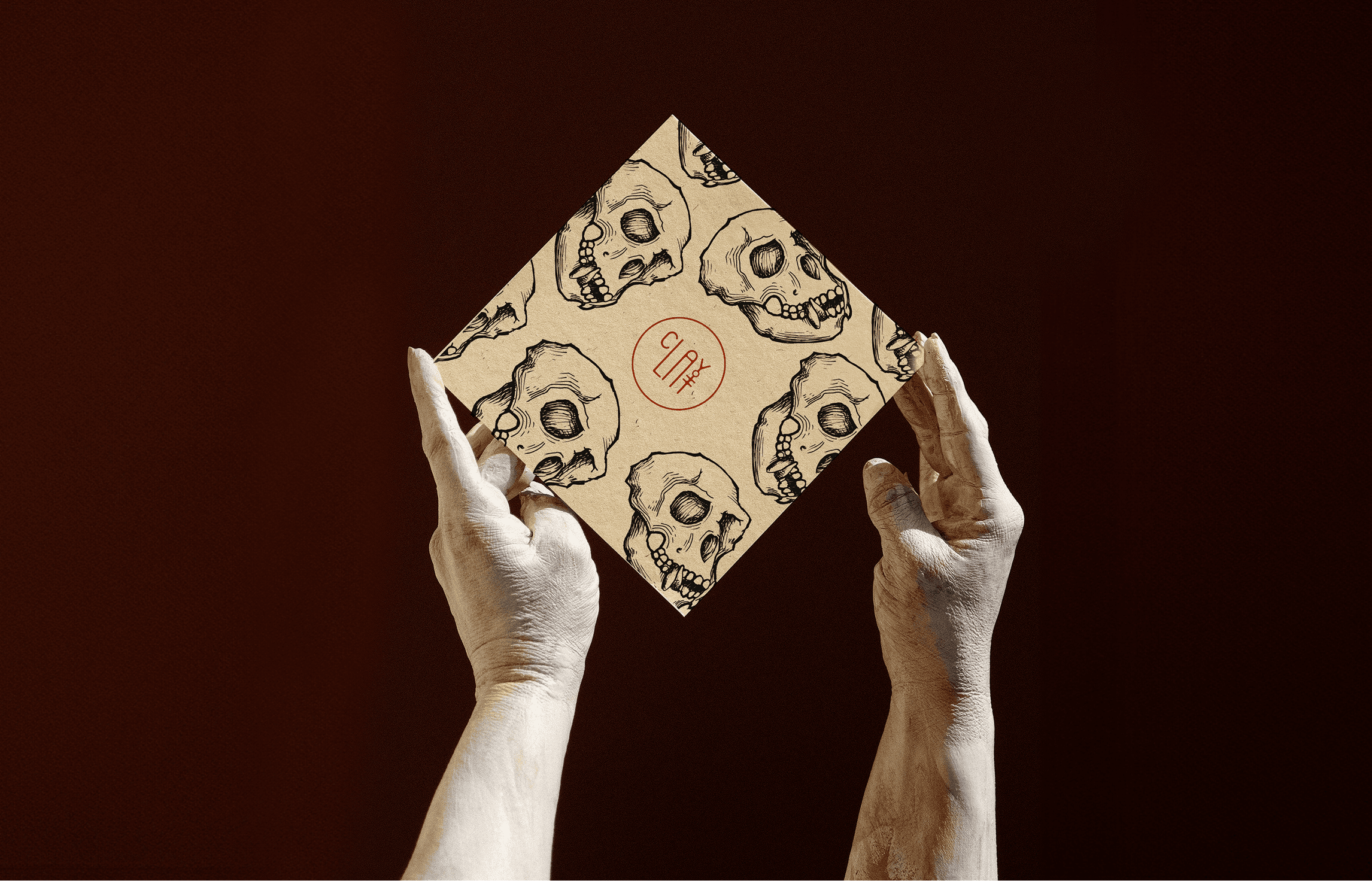
Ceramics brand identity for Claylat, rooted in the landscapes of the Western Cape
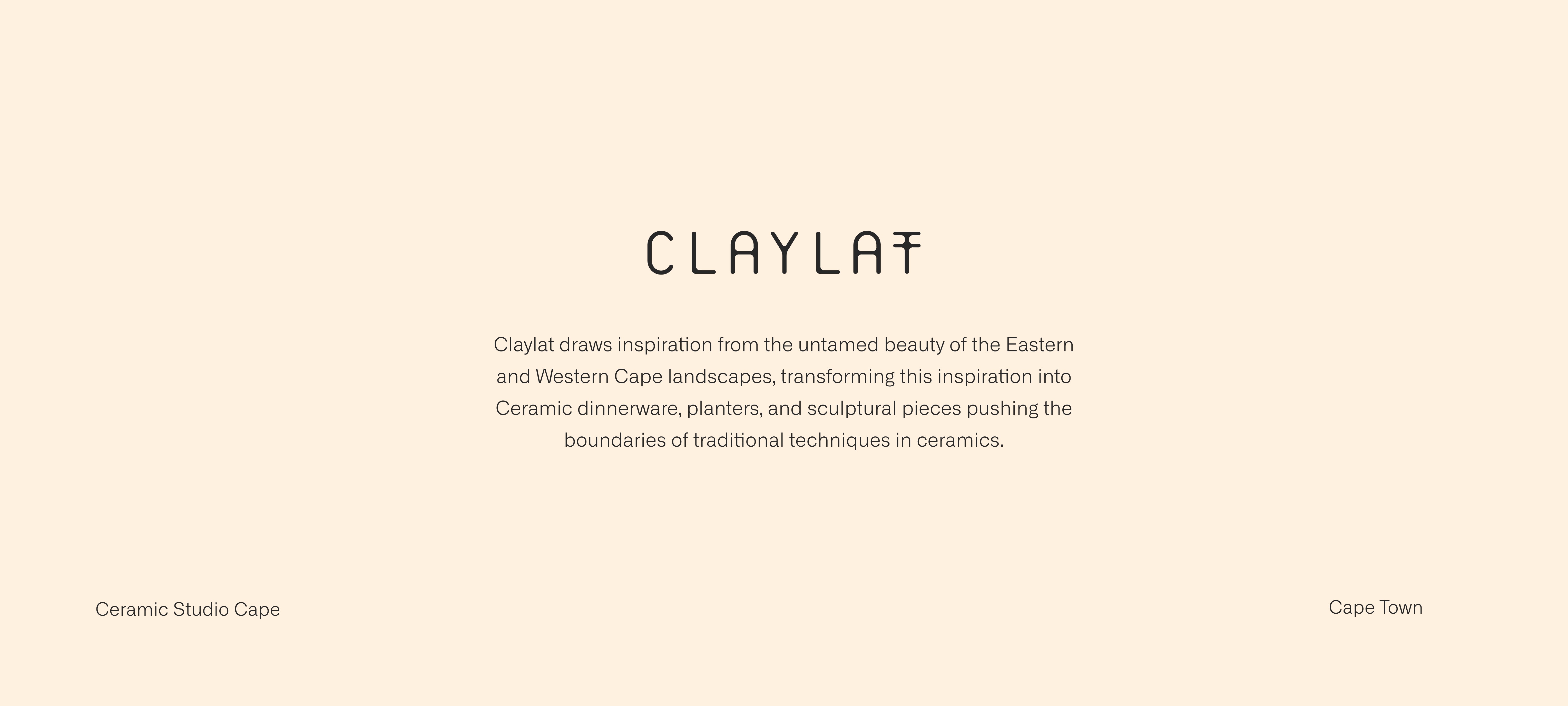
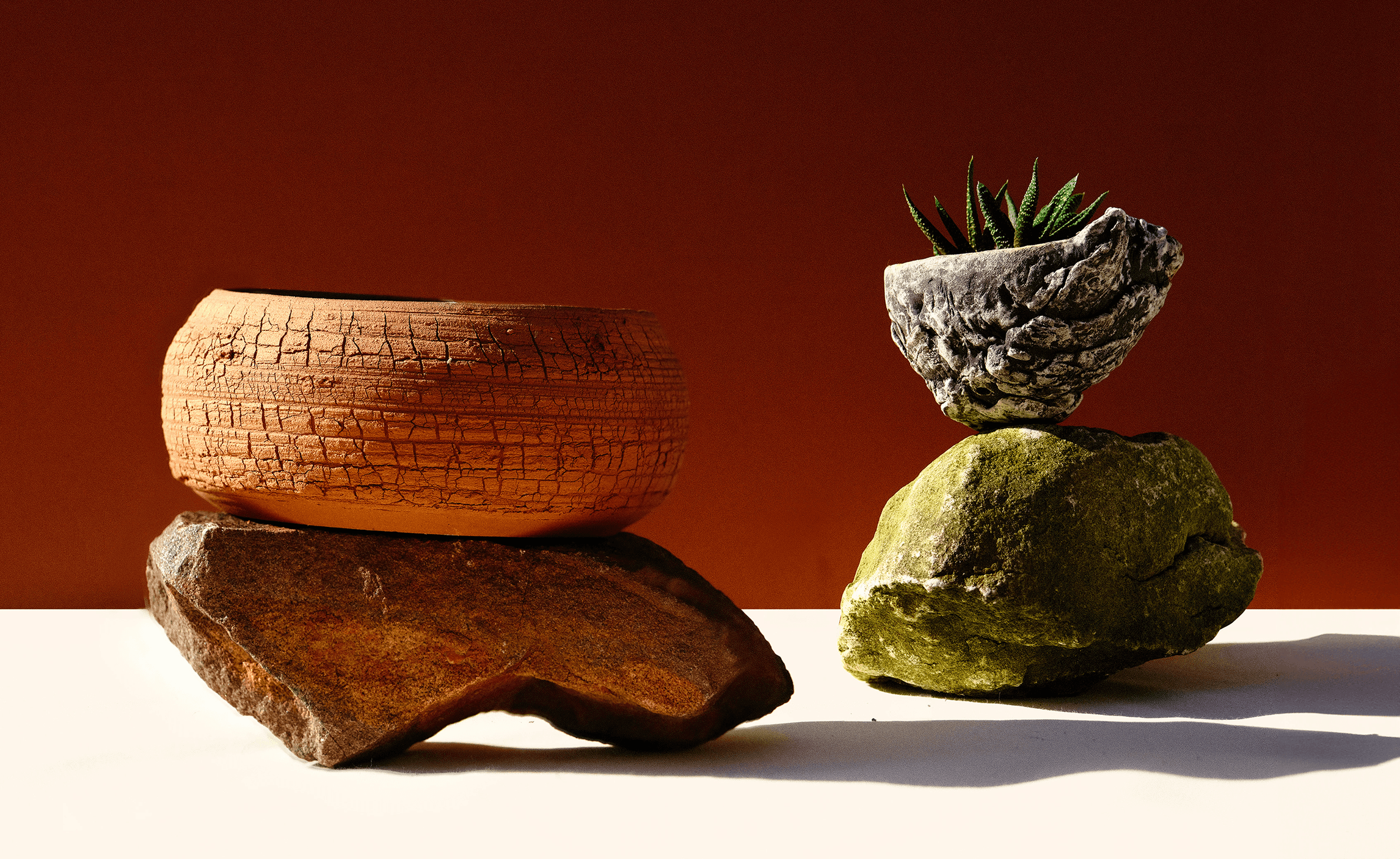
Claylat’s ceramics draw their inspiration from the raw beauty of the Eastern and Western Cape landscapes, translating it into a diverse range of dinnerware, planters and sculptural pieces that push past the conventional boundaries of ceramic craftsmanship.
Research: the Cederberg as a visual language
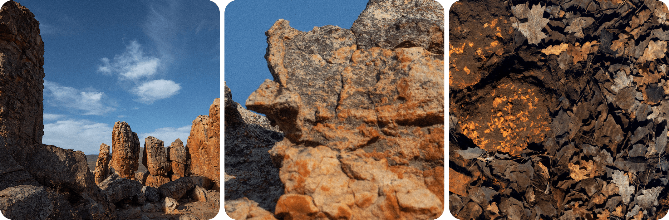
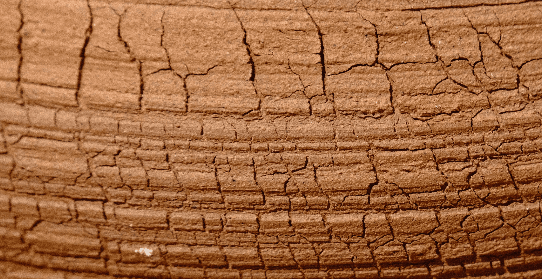
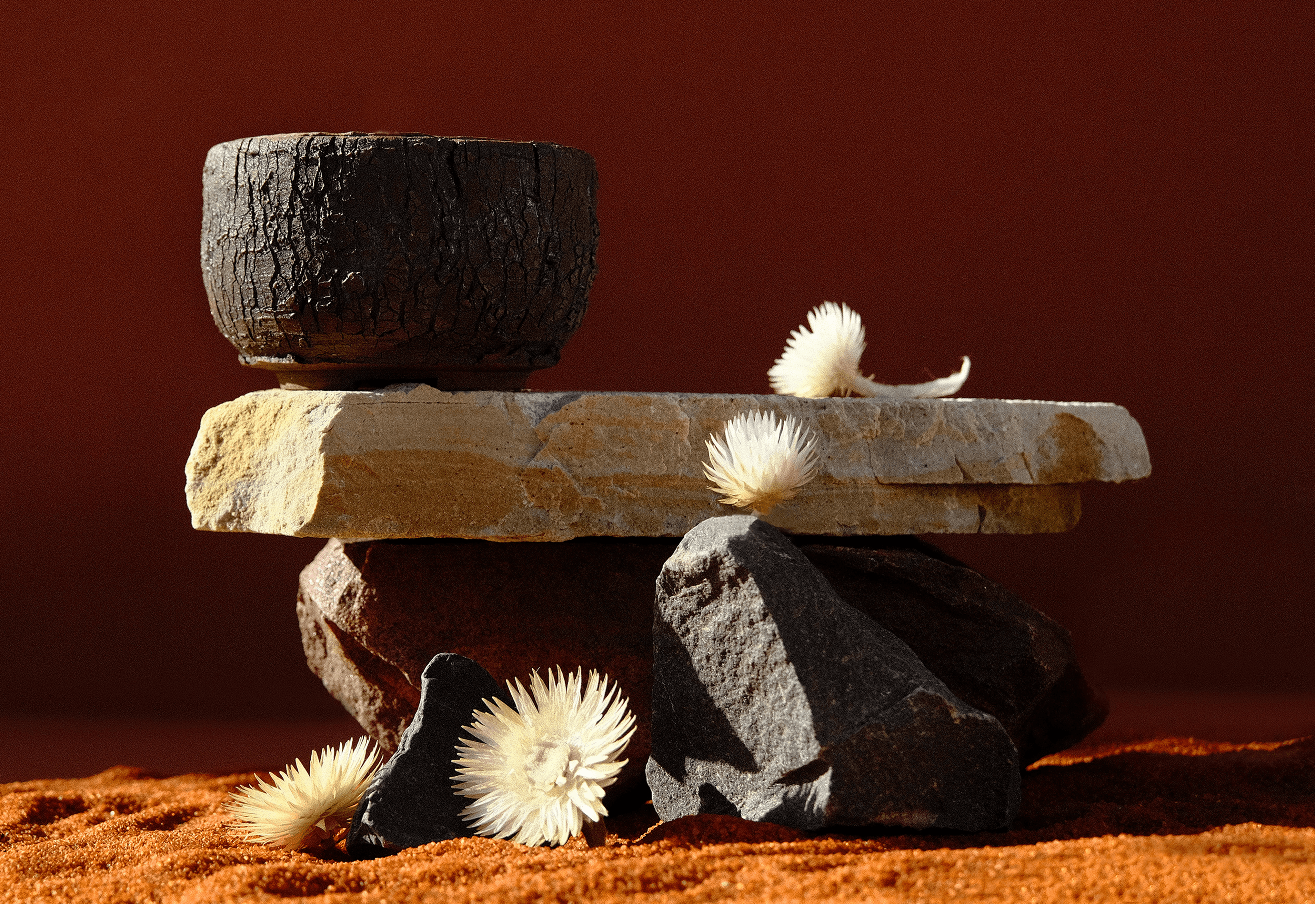
Claylat’s visual language has its roots in the rugged landscapes of the Western Cape, where rock formations, indigenous flora and fauna have a lasting appeal. The Cederberg, in particular, shows the sculpting forces of nature at work: a landscape marked by timeless imperfections. That imperfection is deliberate, and it is reflected in the art direction and photography.
Logo, ceramic marks and print inspired by ancient cave symbols
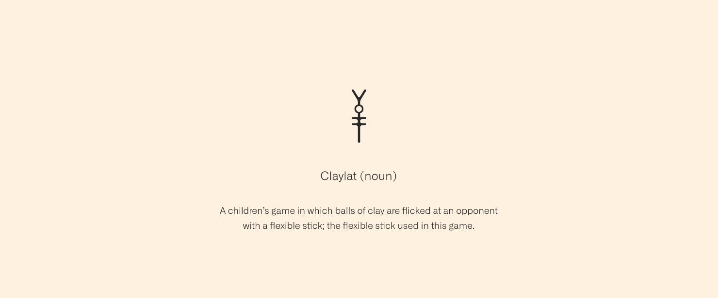
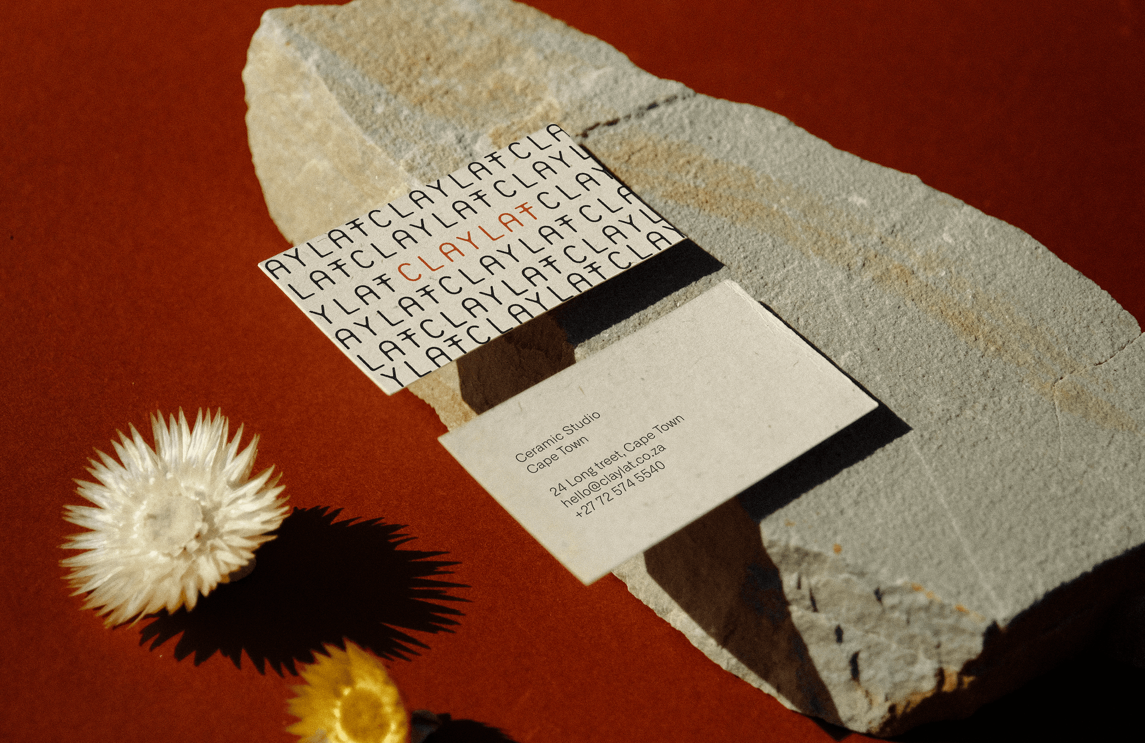
The Claylat logo and ceramic marks are minimal, drawing on the symbols found in ancient caves. The marks are printed on raw, recycled papers, and illustrations bring elements of fauna into the visual language to complete the identity.
For another brand identity, see my interior design branding for Laura Kay.